Oct 20, 2023
Salt — Prospa's Design System
What is Salt?
Salt is Prospa’s design system for products and digital experiences. It’s a collection of reusable components and tools, guided by clear standards, that can be assembled together to build digital products and experiences.
The goal of Salt Design System is to improve UI consistency and quality while making our software design and development processes more efficient. Salt also helps to establish a common vocabulary between everyone in our organisation and eases collaboration between different teams and disciplines.
My role
I joined to refine & impliment a rebrand across all products, lead the design system & build out a design system team.
My responsibilities included:
- Rituals for the design system team: 1:1s, daily standups, and office-hours for collaboration
- People Management: Feedback, development, performance management, mentoring and hiring
- Product Management: Roadmap, prioritisation, sprint refinement, planning and stakeholder management
- Aigning with and coaching designers and PMs to help ensure the work is aligned to the company & team goals
- Facilitating user interviews and opportunity brainstorms
- Training others in all things design - from design thinking to design systems
- Clarifying unwritten goals and principles held by leadership to help guide PMs and designers
The problems & opportunities
During the creation of Salt, we considered three key user groups: designers, front end developers, and the business’ key stakeholders.
In order to create an effective system that would be endorsed and adopted by the product teams, we first needed to understand the challenges they currently faced.
Designers’ painpoints
When Salt started, there were several mini UI kits being used inconsistently across different products. By interviewing our fellow design teams, we were able to outline the following issues:
-
Each design team owned different parts of several products, and assets were not being shared among teams. Each designer was constantly having to rebuild assets.
-
The design direction had diverged between products, creating ever increasing design & tech debt.
-
No detailed specs for iconography, basic components, layout, or user experience.
-
Minimal, vague, design guidelines were not enough to give designers confidence when making important design decisions.
Front end developers’ paintpoints
-
Developers from different teams were rewriting the same UI components, often times with different interactions.
-
Each development team decided what framework & language to use leading to the inability to reuse and share components across projects.
-
Accessibility wasn’t appropriately prioritized and was difficult to implement correctly.
Key stakeholders’ painpoints
-
The CEO & CPO wanted to use the design system team to define & impliment a major redesign.
-
The company went through a rebrand as the team was being built out—so needed the newly formed design system team to rapidly gain context and define a plan to achieve minimal viable rebrand.
-
The ability to contribute was essential to the success of the system without needing to add more team members to the design system team.


Outcomes
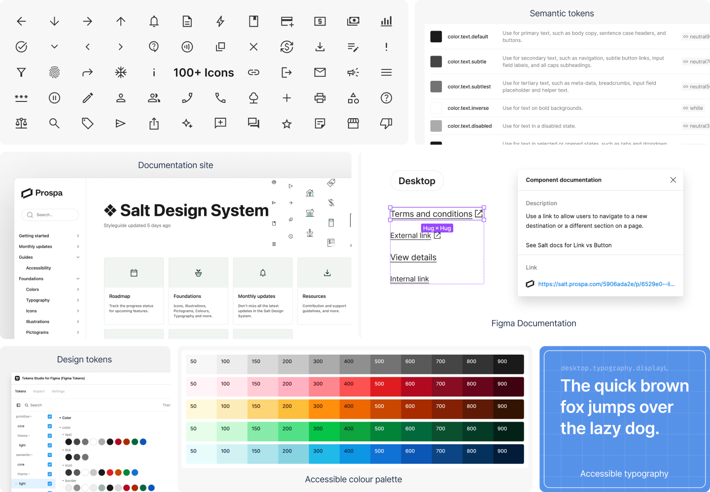
Based on our interviews it was clear that the system needed three distinct parts: a design system website, a coded component library, and a Figma design kit. The site and components are built to meet the WCAG AA requirements for accessibility, so that individual teams do not have to worry about complying with those standards when using our assets.
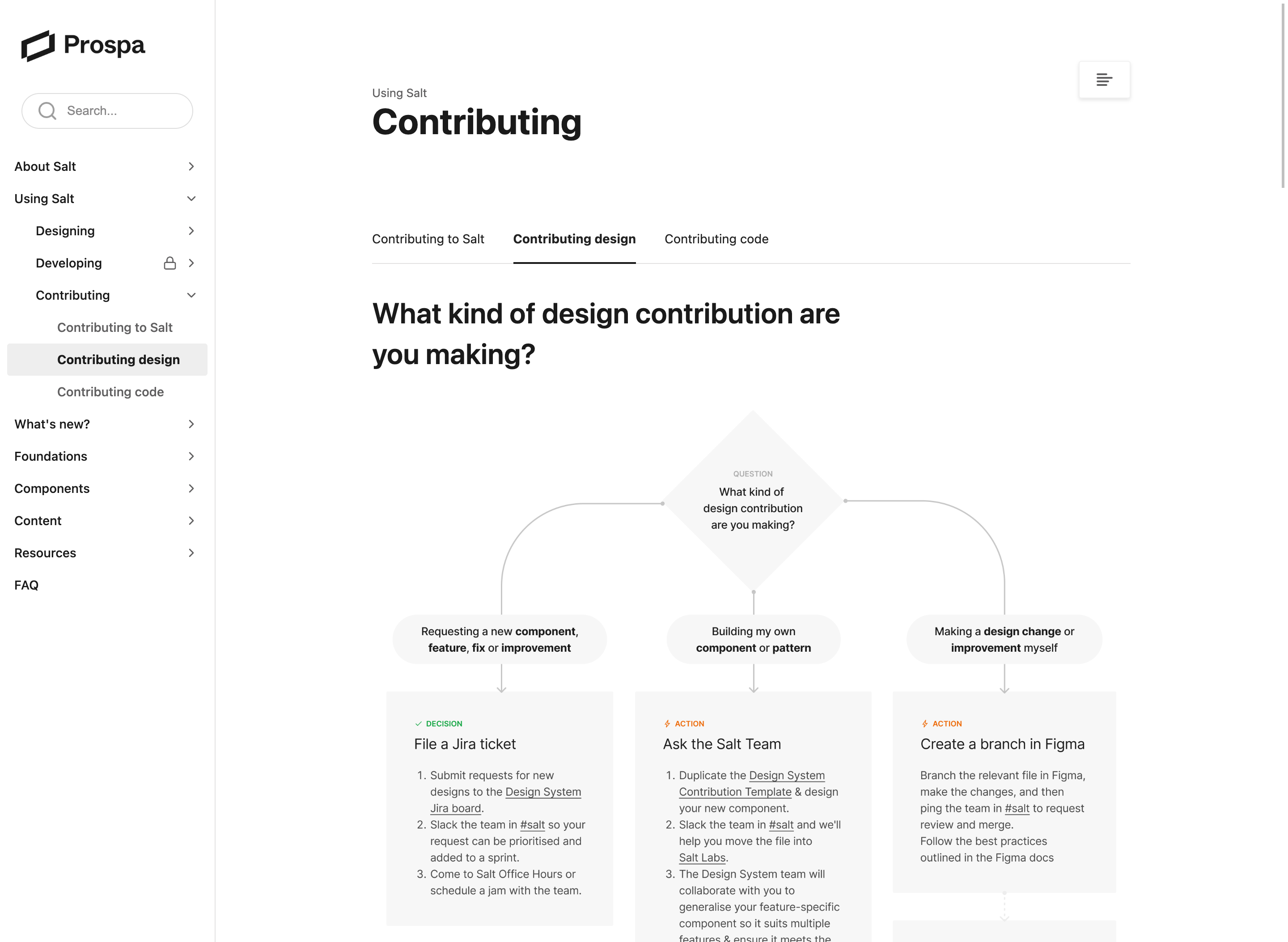
Design system website
A central repository that all users could reference as a one stop shop for anything related to the design system. The site houses all our guidelines, style and component documentation, and design resources.
Component Library
A coded library of all universal components used across product. The components are built in vanilla-extract, JavaScript and React. Each component is modular, and can be striped down or dressed up as necessary to fit each team’s needs.
Design Kit
A Figma library with all of the Salt components, templates, and foundational elements (color, typography, grids) outlined for quick use and consumption.
While we have the foundations, processes and begining of components up and running, we understand that this work is never done. Salt is a living, breathing product that grows and updates weekly; it adapts with the product as needed and any Prospa product &feature that may adopt it in the future.