Feb 23, 2022
Vivid Sydney
Vivid Sydney is an annual festival of light, music and ideas, held in Sydney. It includes outdoor immersive light installations and projections, performances by local and international musicians, and an ideas exchange forum featuring public talks and debates with leading creative thinkers.
Now in its 10th year, Vivid Sydney has become the world’s largest festival of light, music and ideas, putting the famous harbour-side city of Sydney firmly in the spotlight for 23 electric nights.
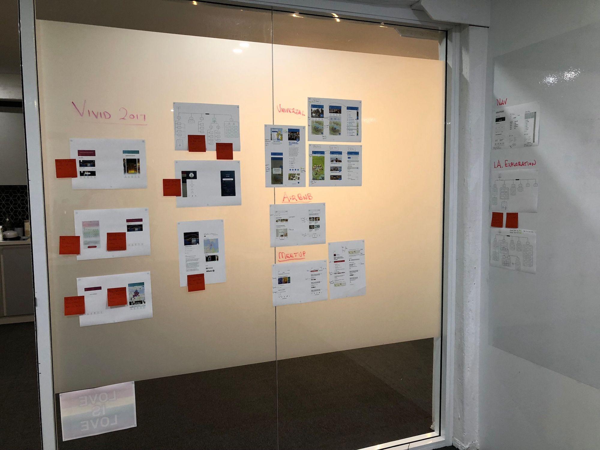
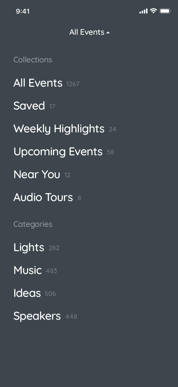
Previous Vivid App
What could I learn from the previous years app? By reviewing the previous app design & analytics, I could make educated decisions helping give the users what they want.
Initial Thoughts
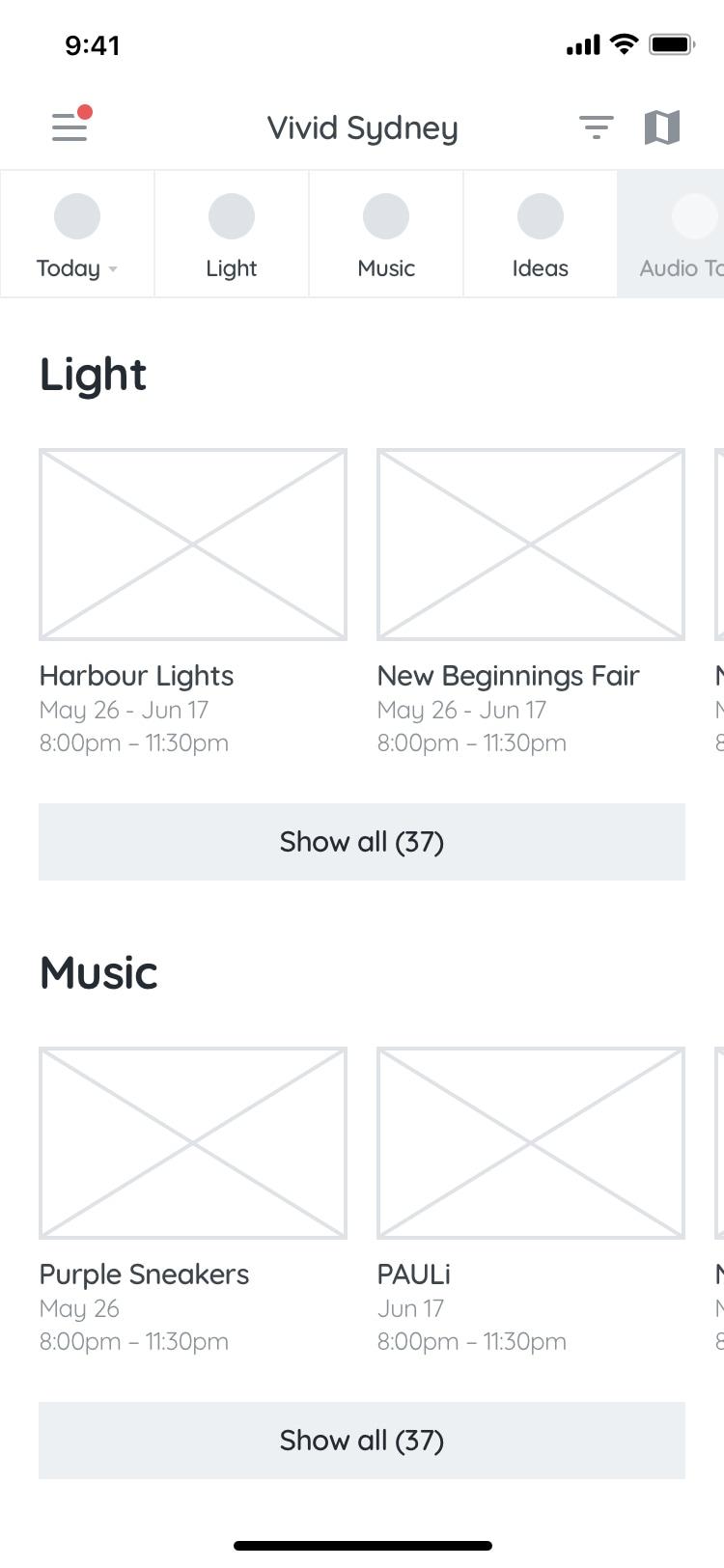
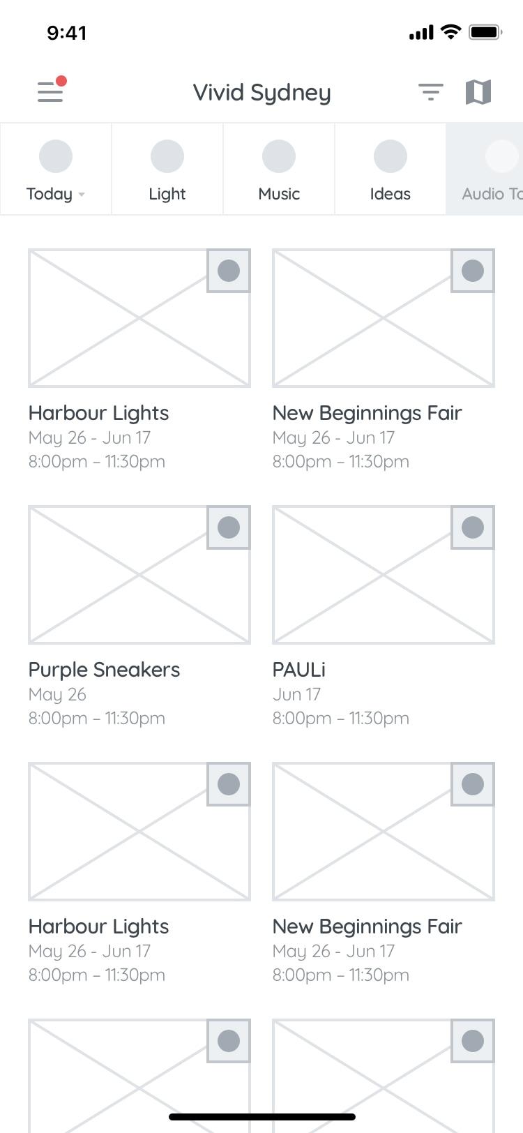
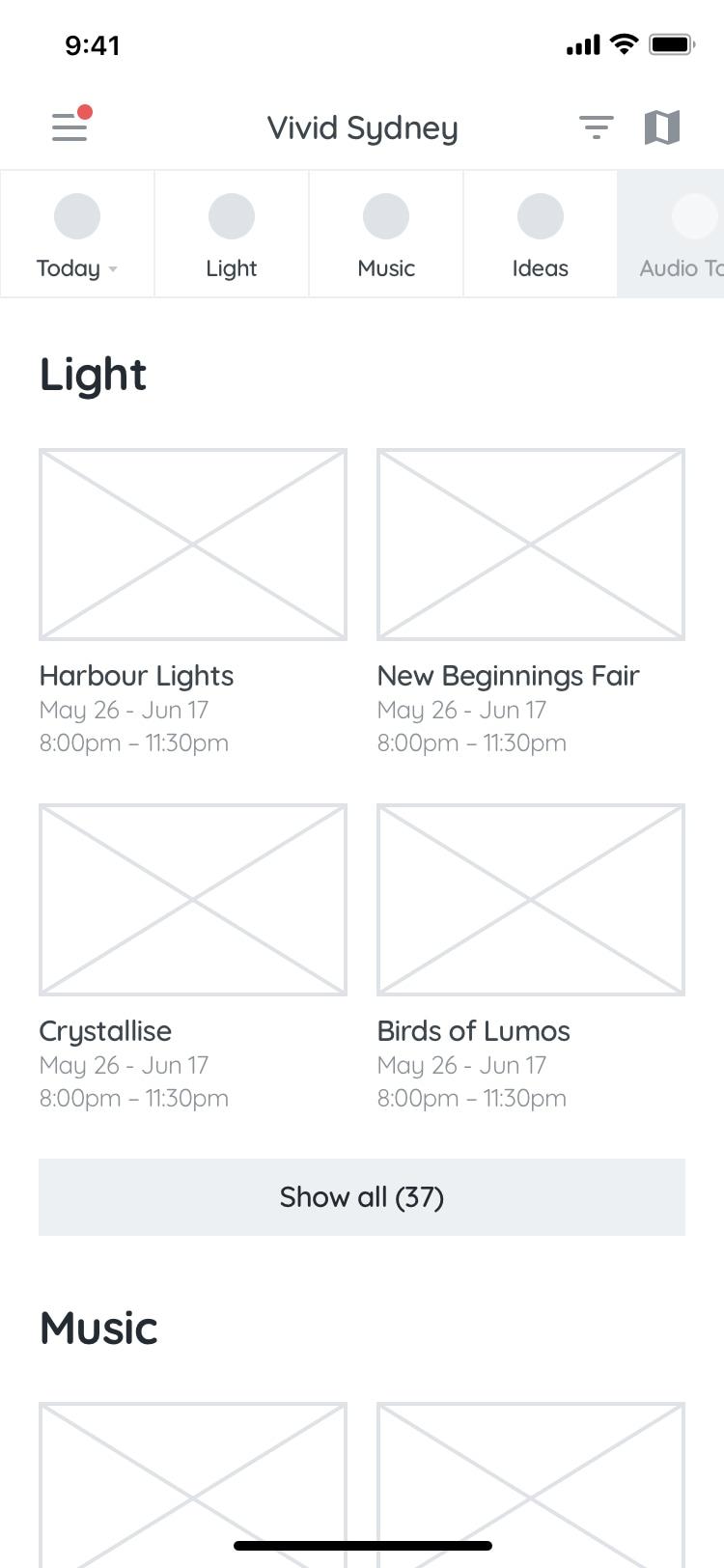
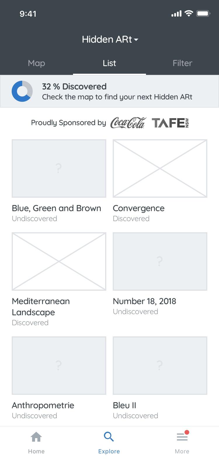
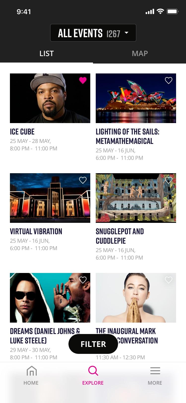
- List view
- Only 1.5 cards visible at a time
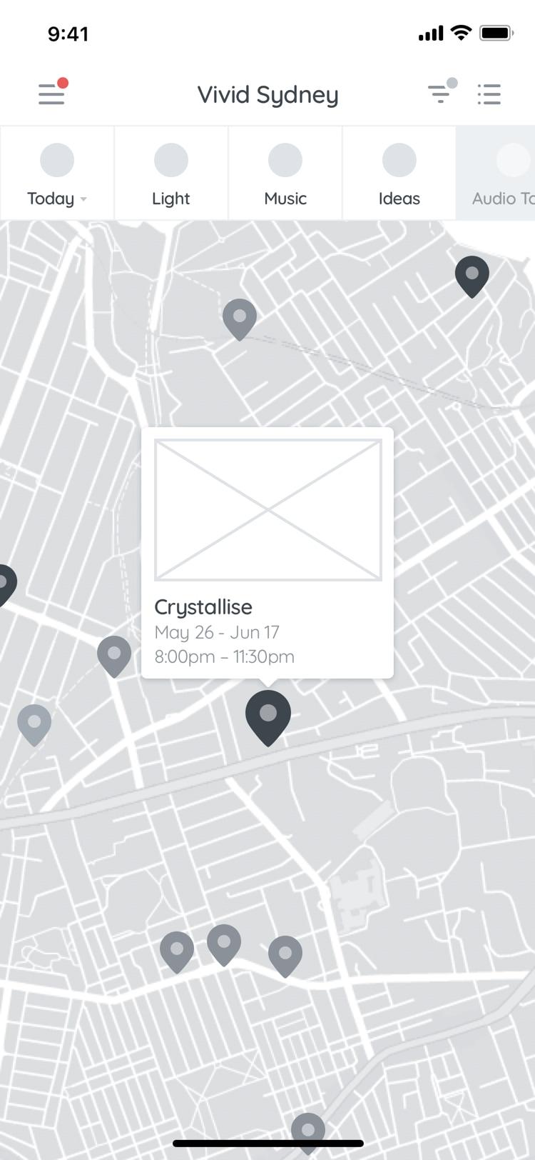
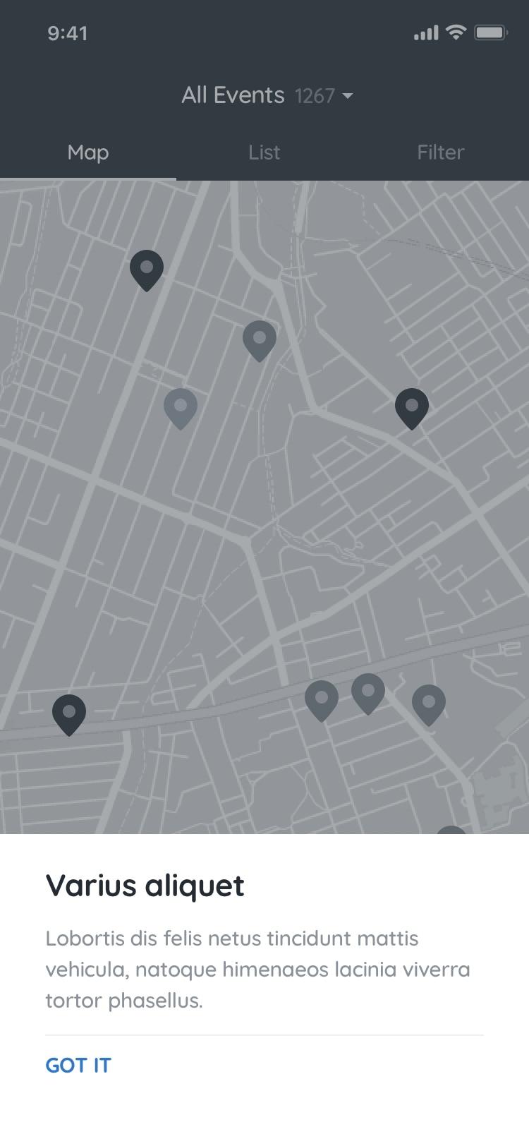
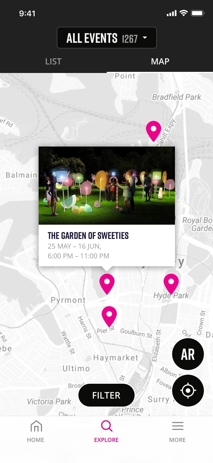
- Map view
- overwhelming with no way to filter
- hidden under Guide, in the 2nd position
- Alerts 2nd tab from the left but rarely used
- Explore & Guide have similar content, displayed in different ways
- Speakers was a list of 502 that scrolled forever
Summary
The previous year’s app was very disjointed and unintuitive. Having visited Vivid before & supported by the data, the Map view was the go-to to see what’s around you.
Previous App Analytics
- 59,304 total downloads (70% iOS, 30% Android)
- 185,360 sessions
- 399,723 items saved to My Vivid
- Beacon detections - when a device detects a beacon (not unique by device, just the total number): 180,487
- 10,088 events added to device’s calendar
Top 5 visited screens:
- Light events
- Audio Tours
- Map
- Menu
- My Vivid
Learnings
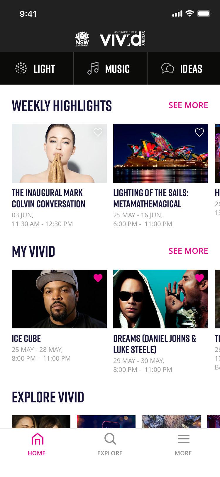
- Light events section was most visited screen, which makes sense as it was the home screen
- Audio Tours was surprisingly the 2nd most viewed screen
- This helped put more focus on what could have been as lower priority
- Map, even though hidden in the app, was a preferred view than lists for users
- Customising their experience, by saving events to My Vivid was well received and the 5th most visited screen
Objectives
Business
- Vivid/Destination NSW wants to push attendance (therefore ticket sales) of Music and Ideas events
- Wanted more users to register/log in for the user data and for the email database for email marketing
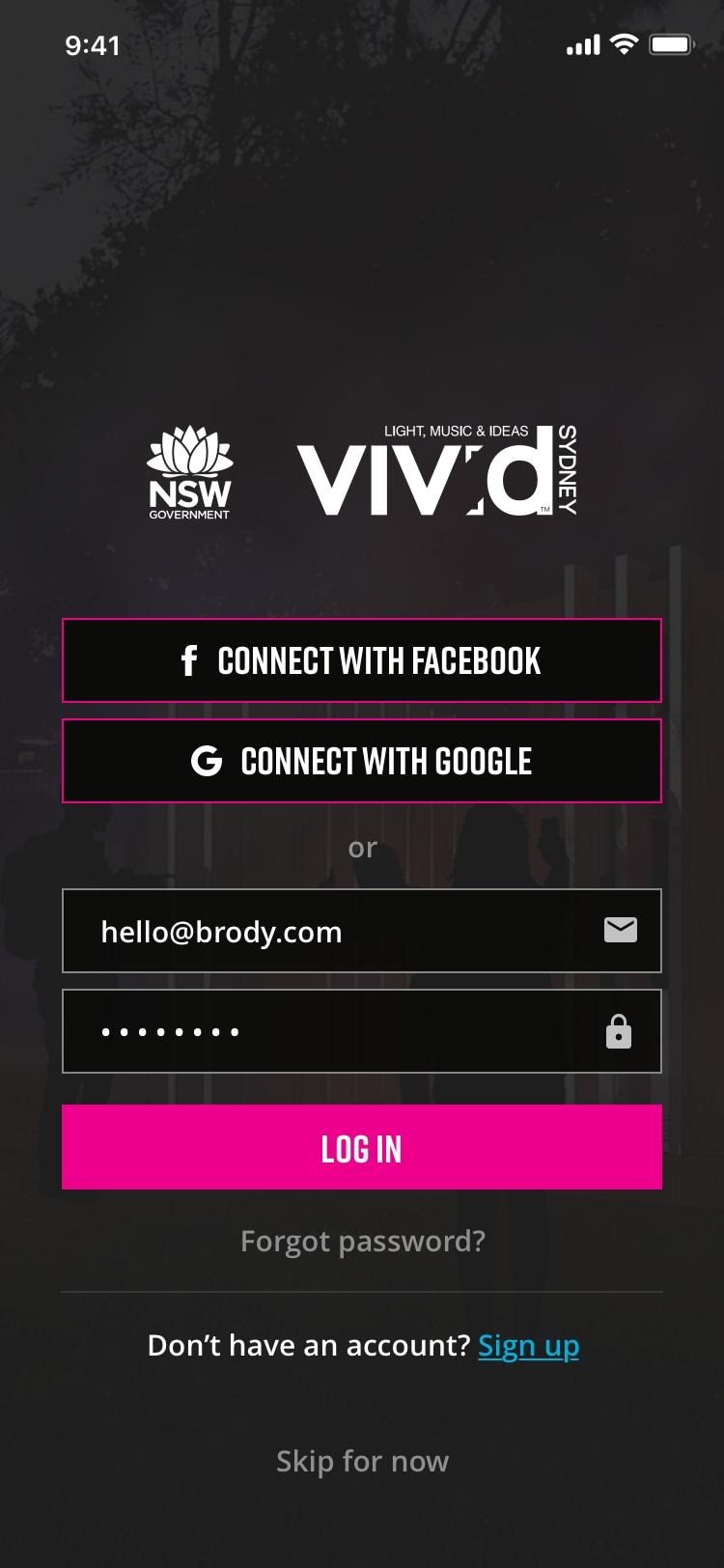
- Understood the previous app was confusing for the user and embraced the idea of simplifying the app
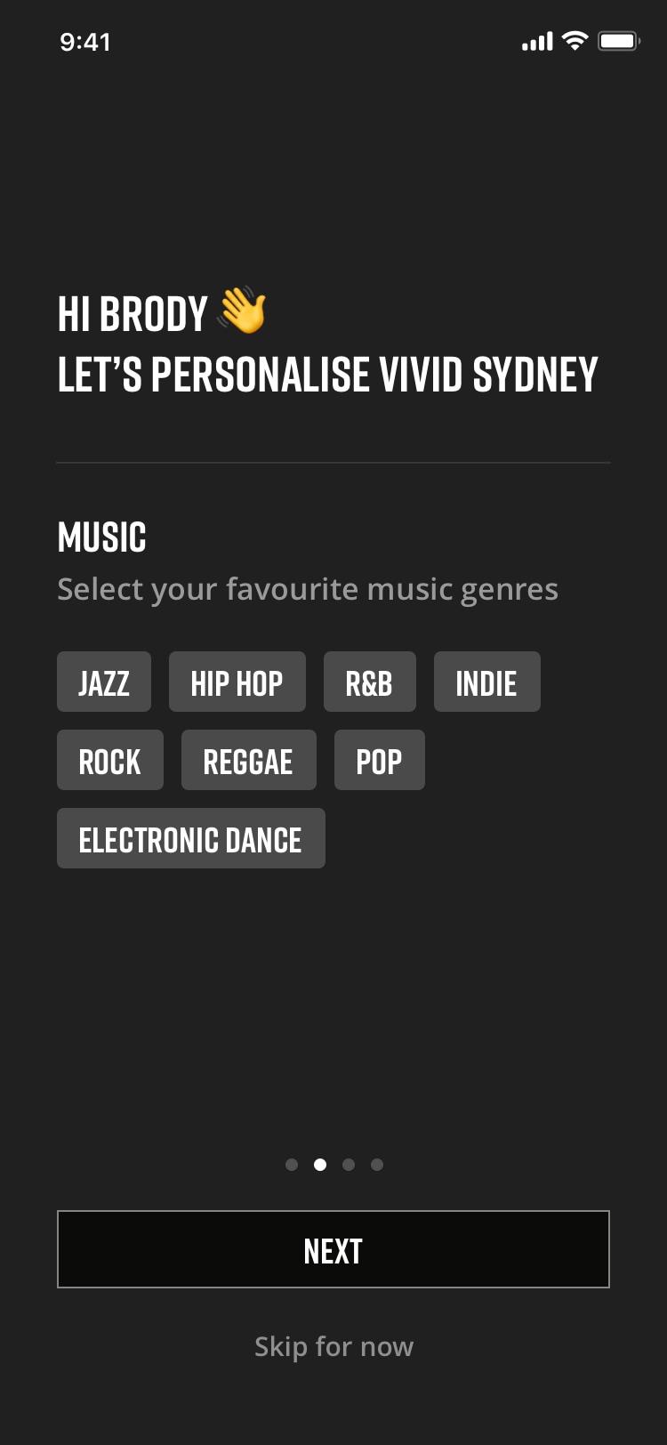
- Adding augmented reality & gamification features to the app
- Needs to control flow of traffic on congested areas
- Audio Tours help with flow and direction
User
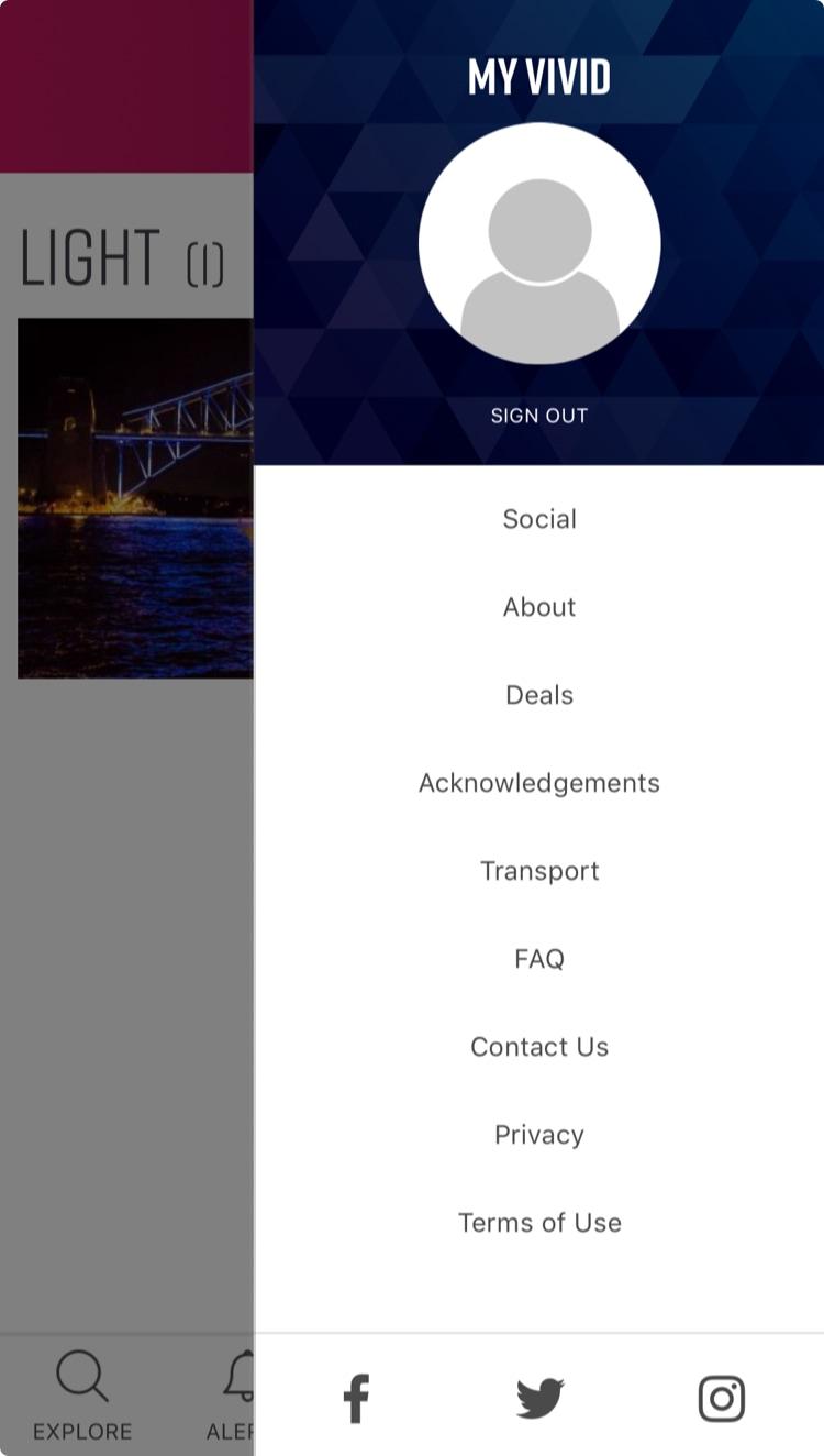
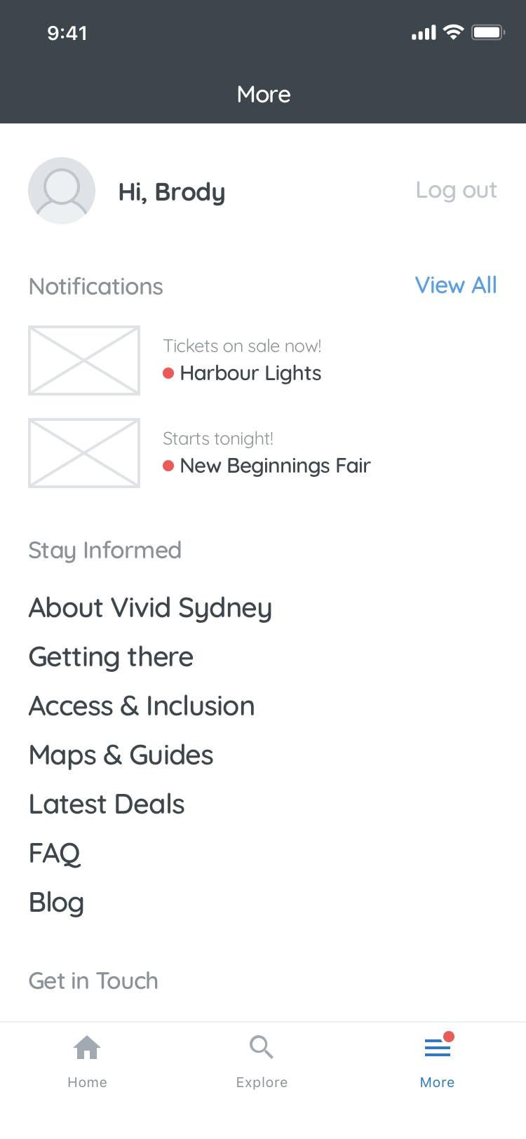
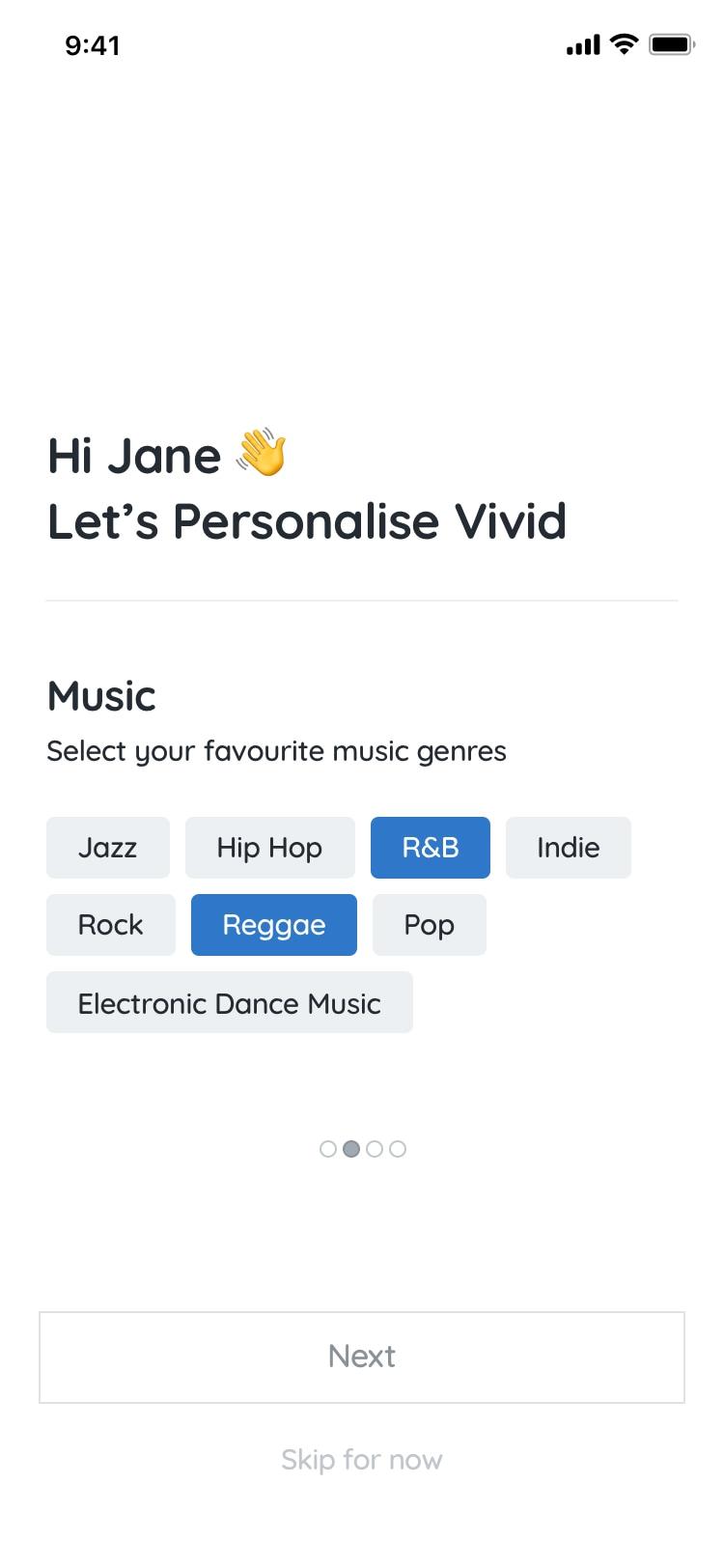
- MyVivid is a great way to save events that interest you
- With so many events, optimising, simplifying & customising the app helps the user find what they want
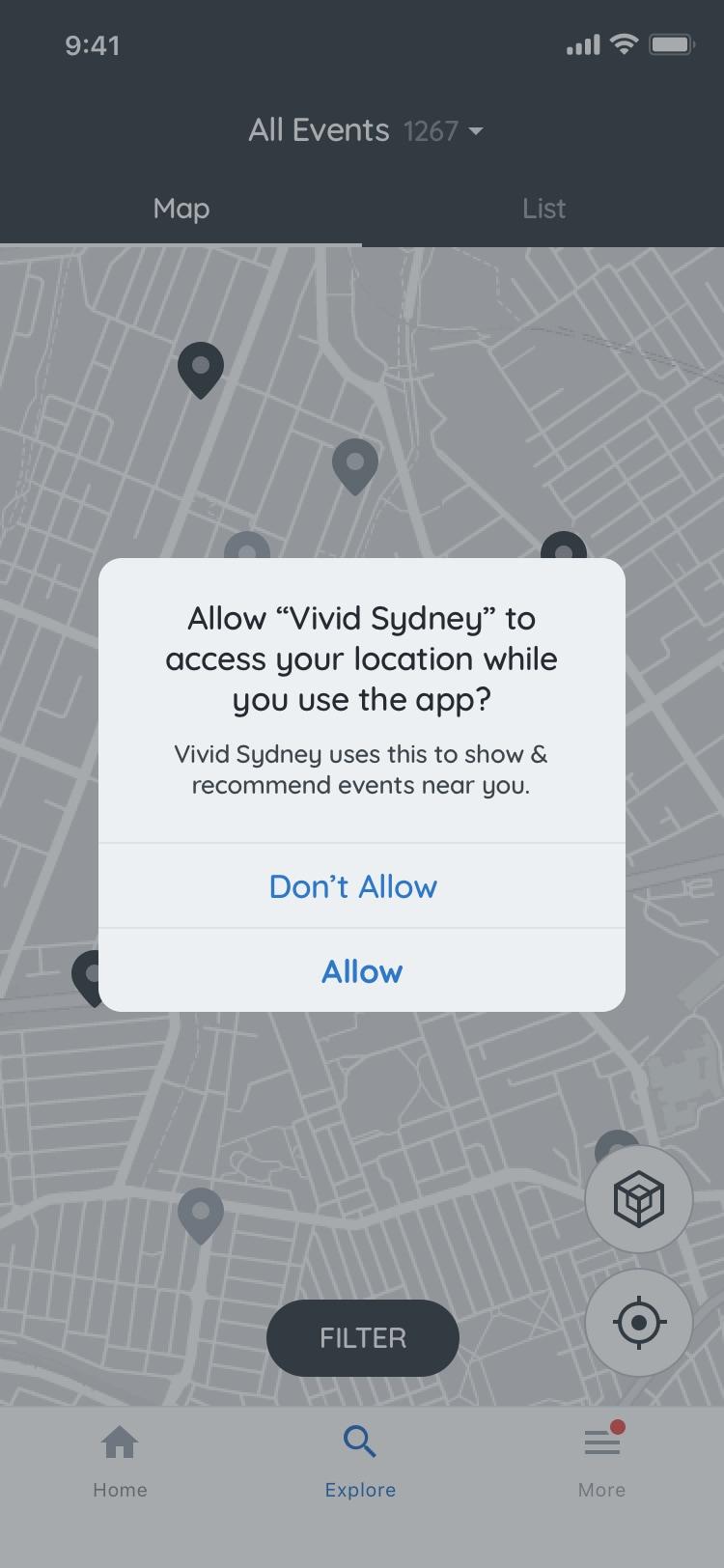
- Getting to and around Vivid is the initial priority
- Info on road closures, parking, public transport
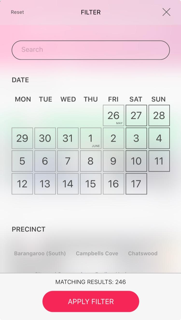
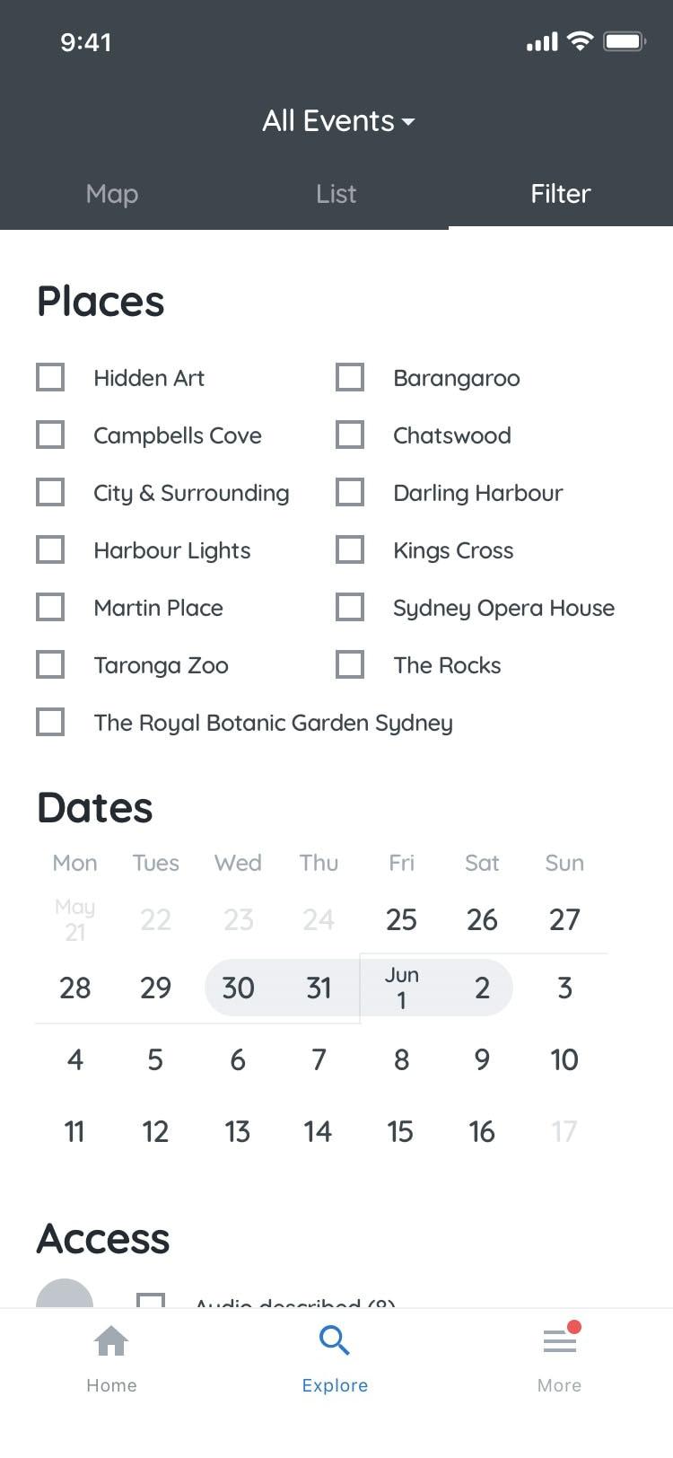
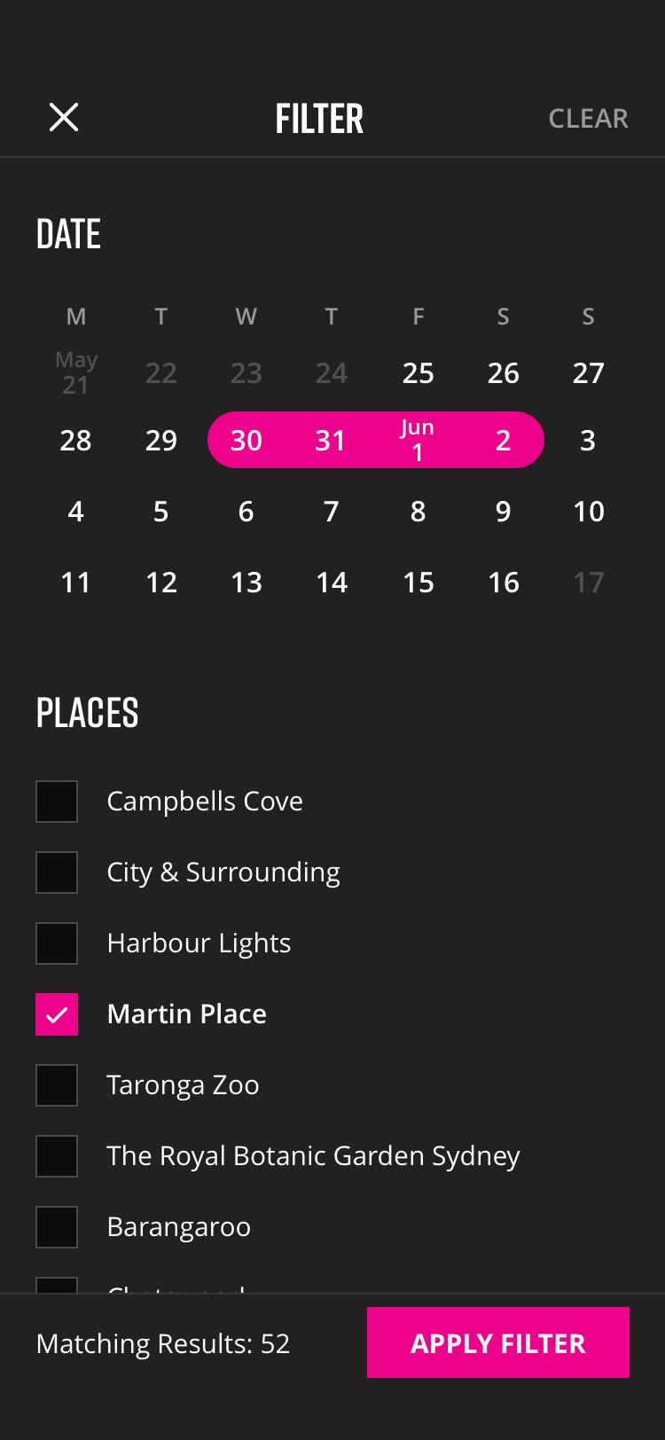
- Map of events around you, on the date you are there/plan to attend (filter by date)
- Wants more information on pieces
- Audio Tour let the user listen to the information
- Lightboxes are hard to read with a number people surrounding them

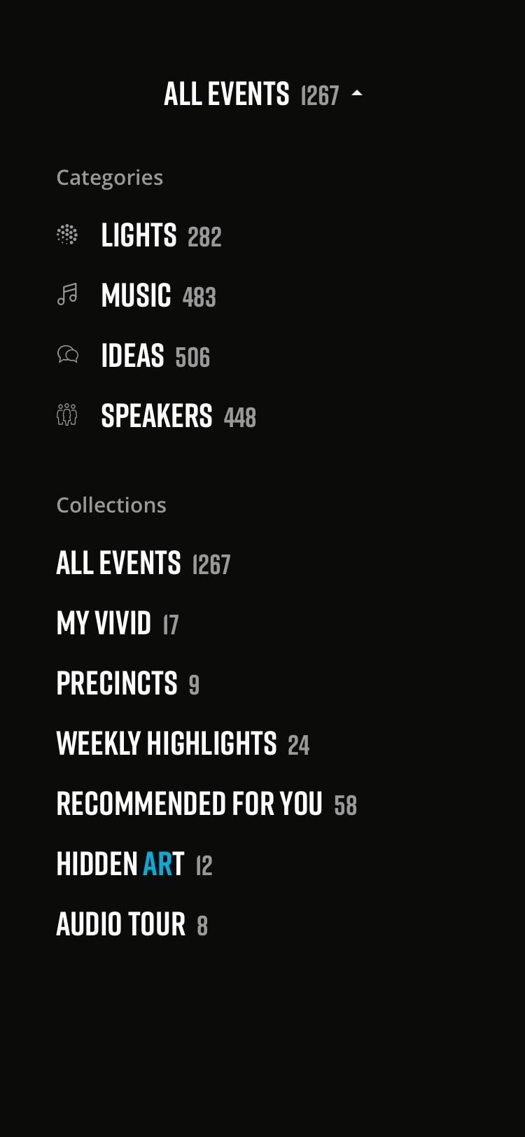
Information Architecture
Previous IA
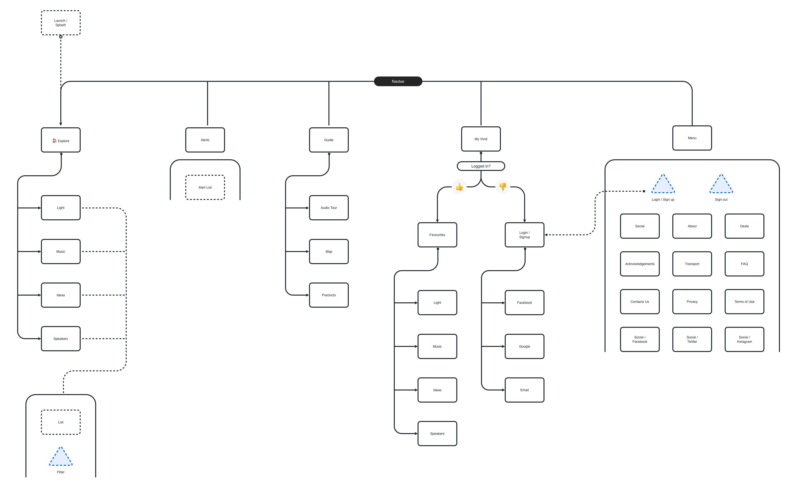
IA Ideation


Notes 🤔
A few iterative loops of IA mapping, combined with wireframes, helped validate (and invalidate) a lot of ideas, helping me rearranging the pieces made the app and content more digestible.
Kickoff Workshop with Destination NSW
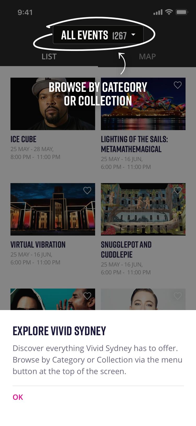
I ran a workshop with the stakeholders from Destination NSW to present my research, Information Architecture & wireframe explorations.
Early in the workshop, I ran a card sorting exercise to get the stakeholders to agree upon and discuss priorities, getting everyone on the same page.
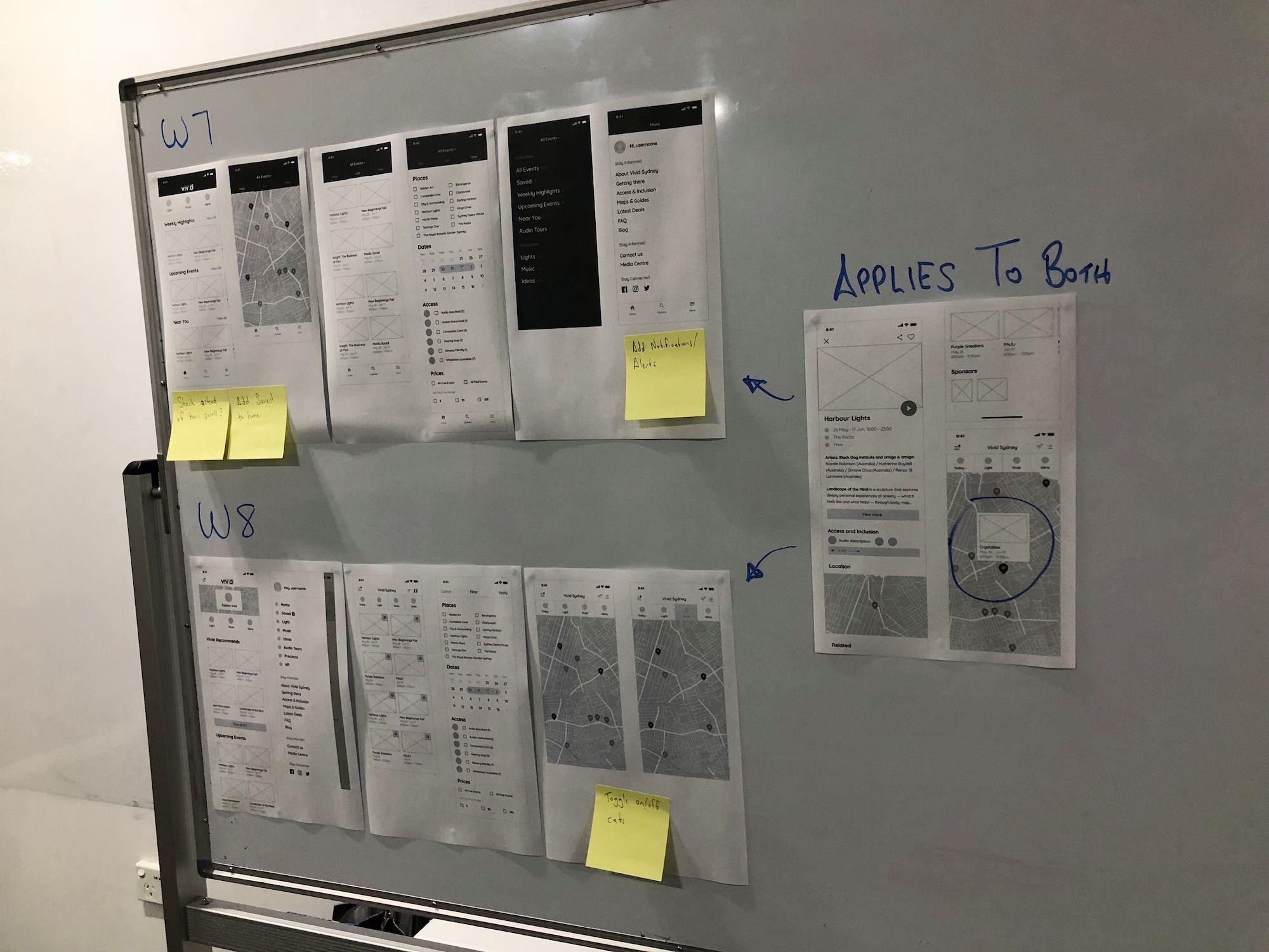
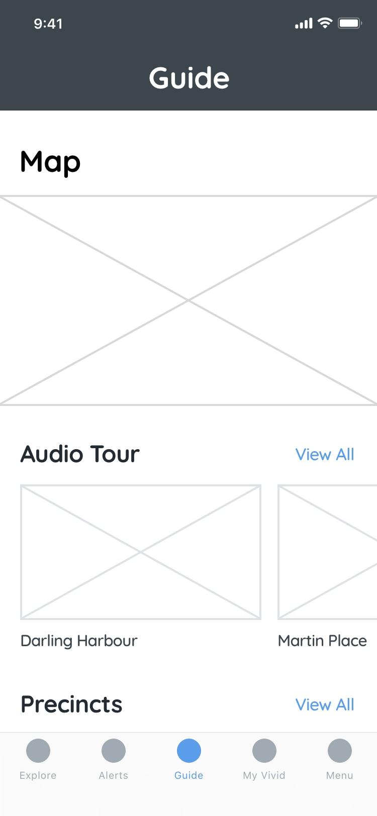
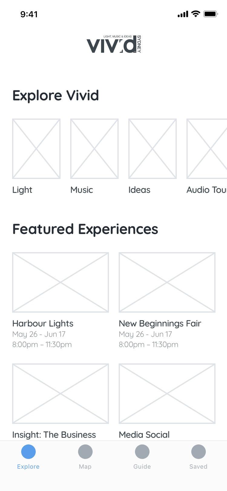
Wireframes
Exploration
After a long exploration of sidebar navs and all sorts of options, I saw @Lukew’s tweet…
Netflix moves to a bottom nav bar on Android (& iOS).
Why? Obvious always wins: https://t.co/coJ7Ge55It pic.twitter.com/iEtnPEeETE
— Luke Wroblewski (@LukeW) February 26, 2018
… which make me simplify the nav and layout even further, with a focus of the navigation being obvious.
Everything clicked with the content and the client once I iterated to this structure.
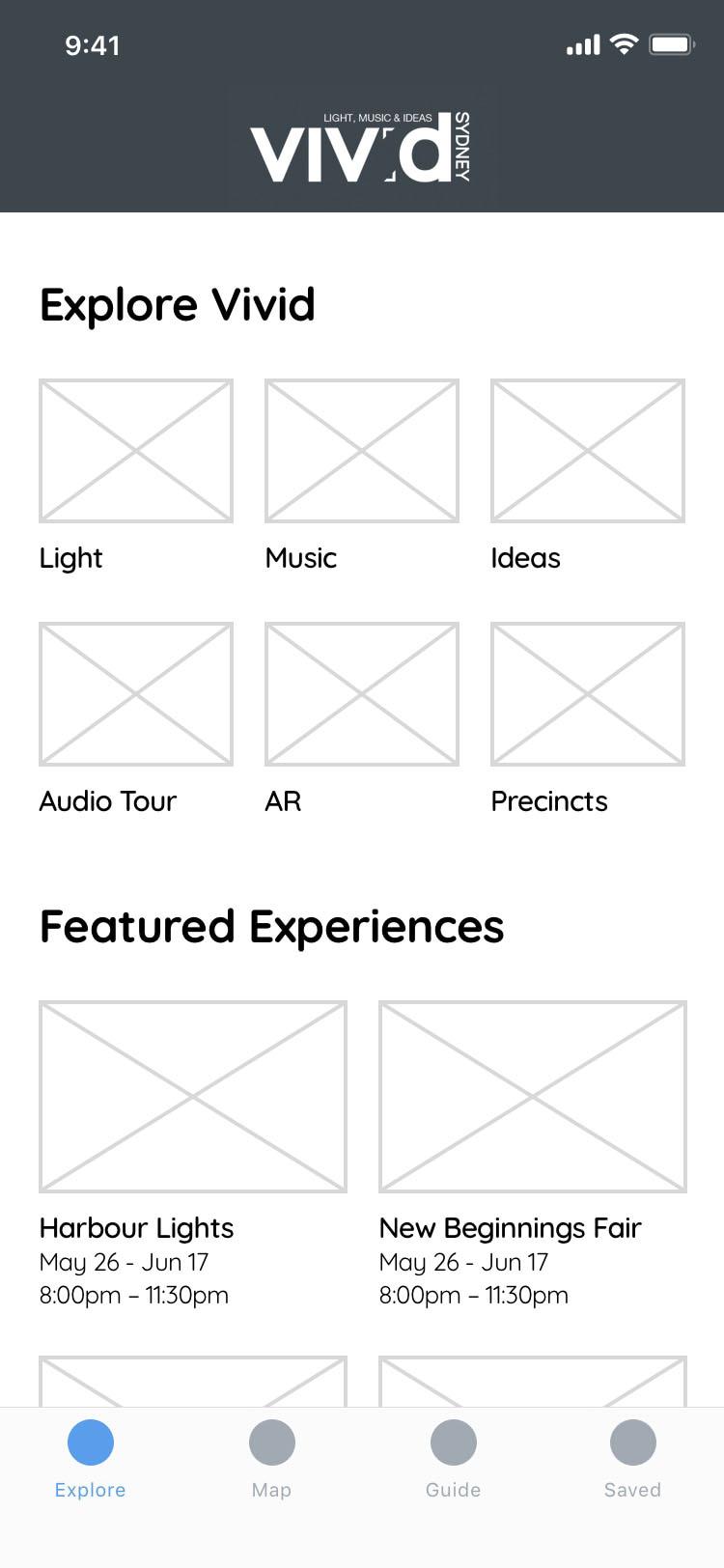
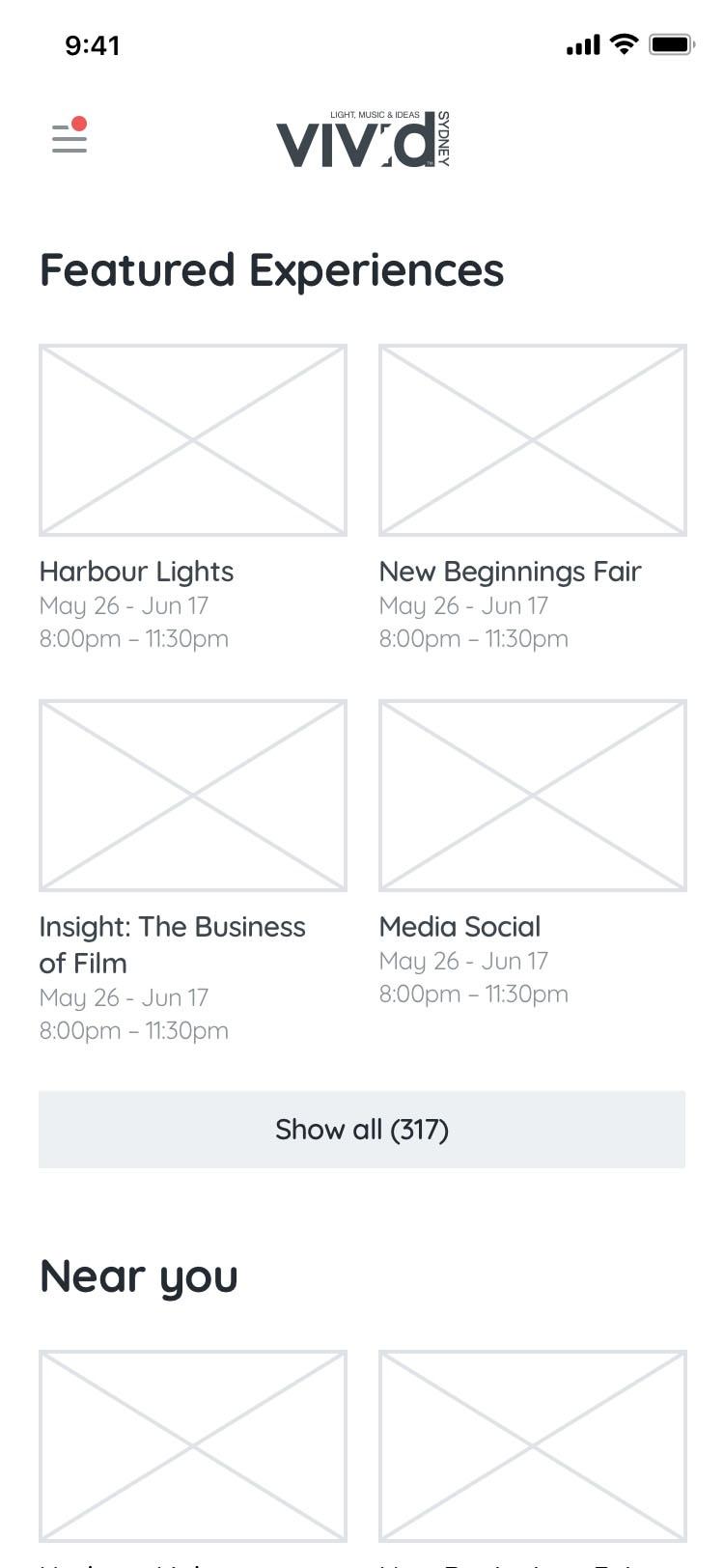
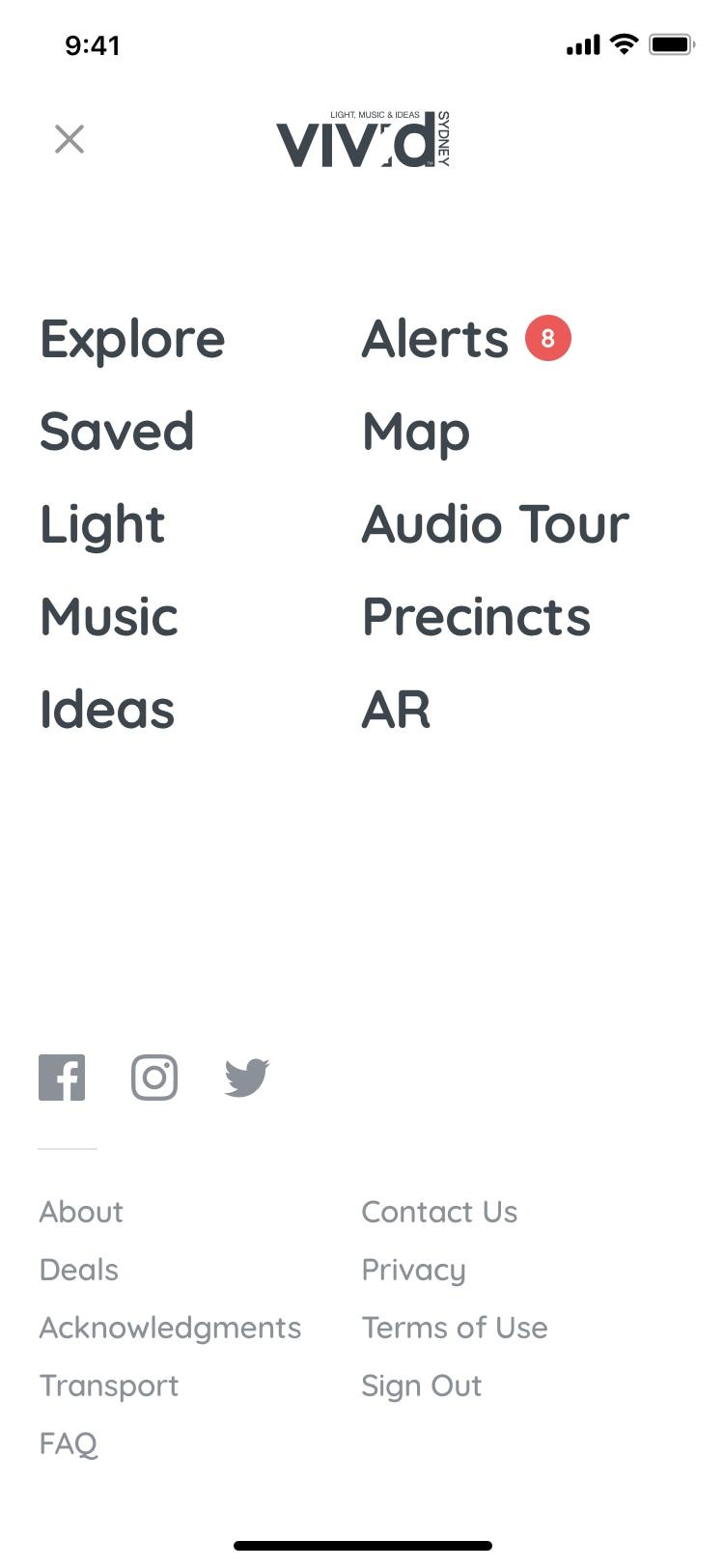
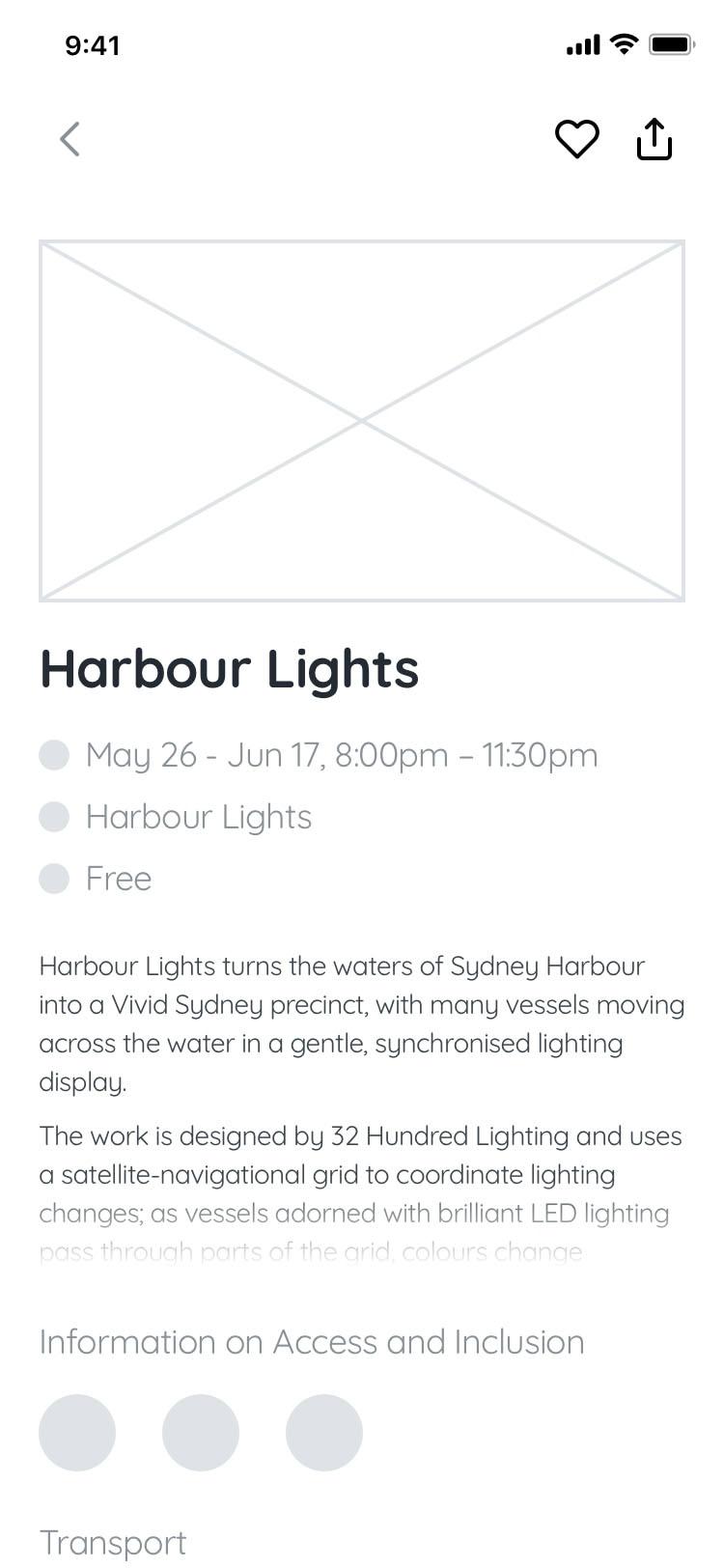
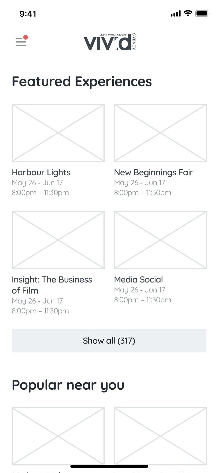
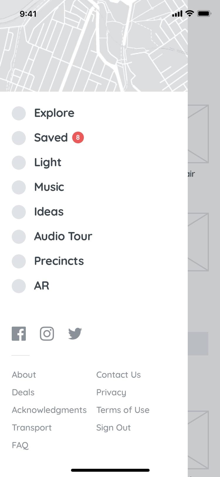
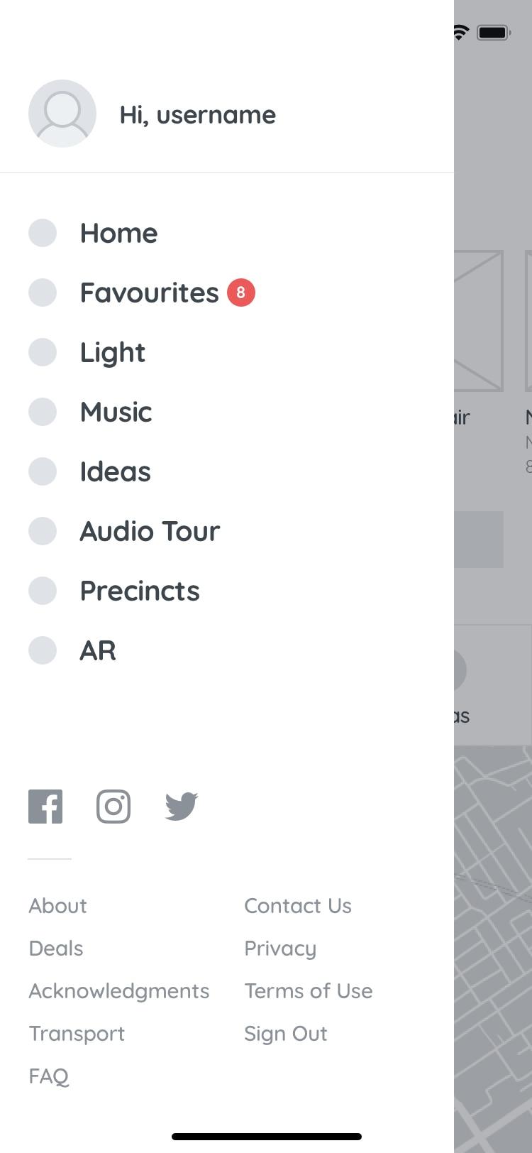
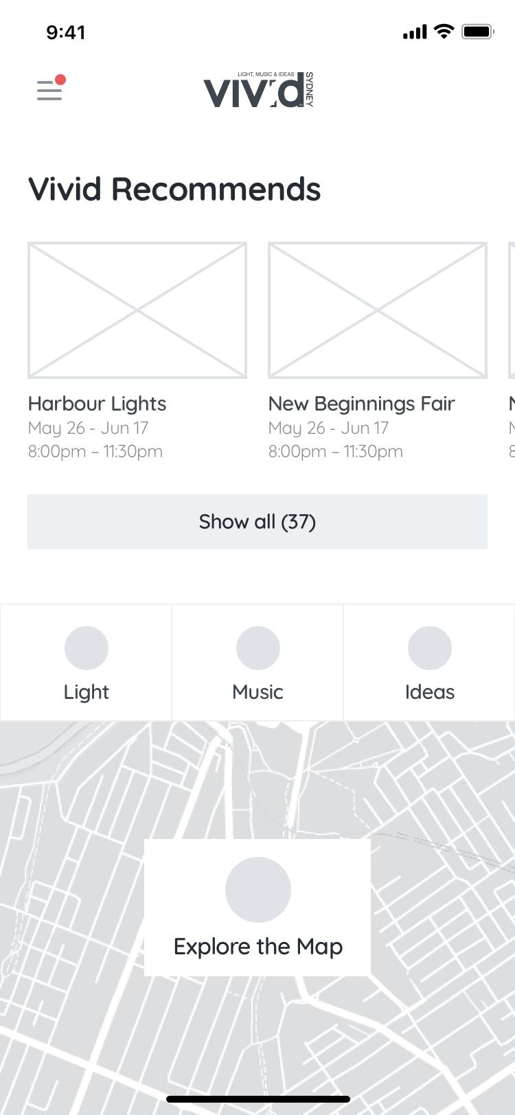
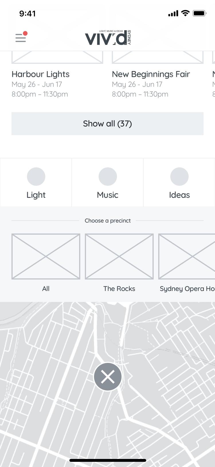
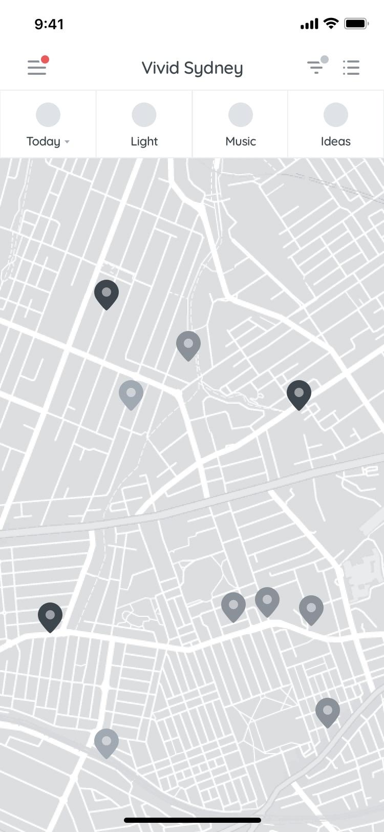
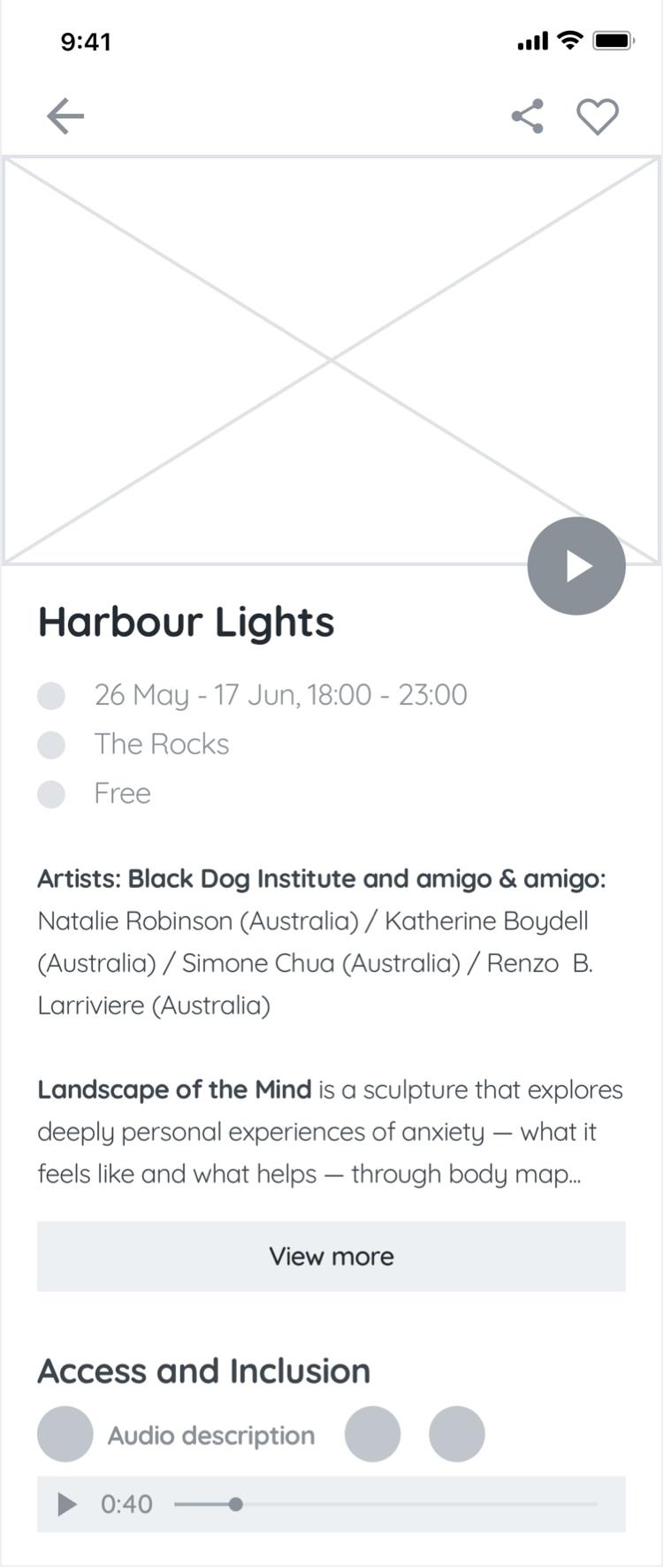
(Not quite) Final Wireframes
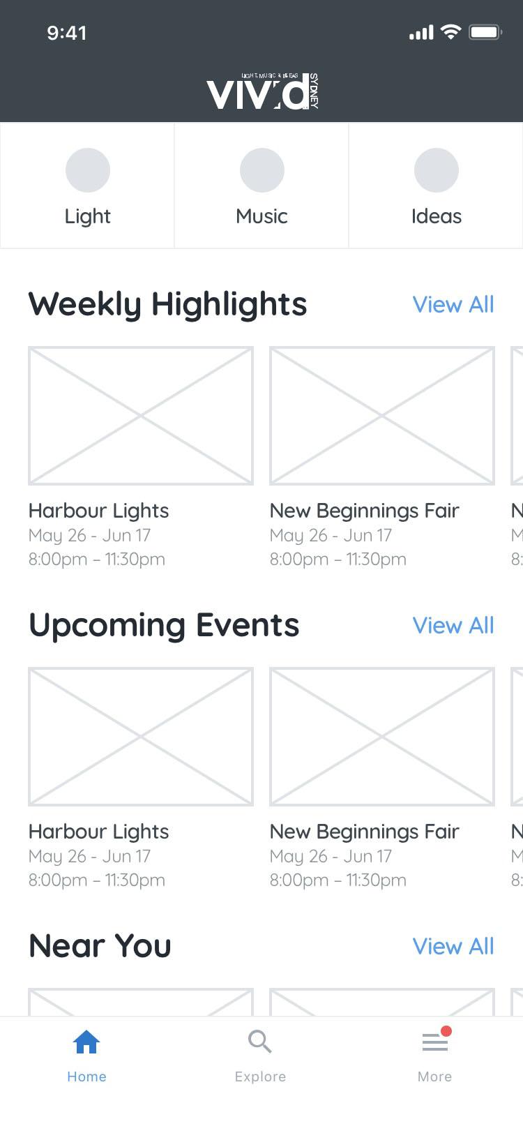
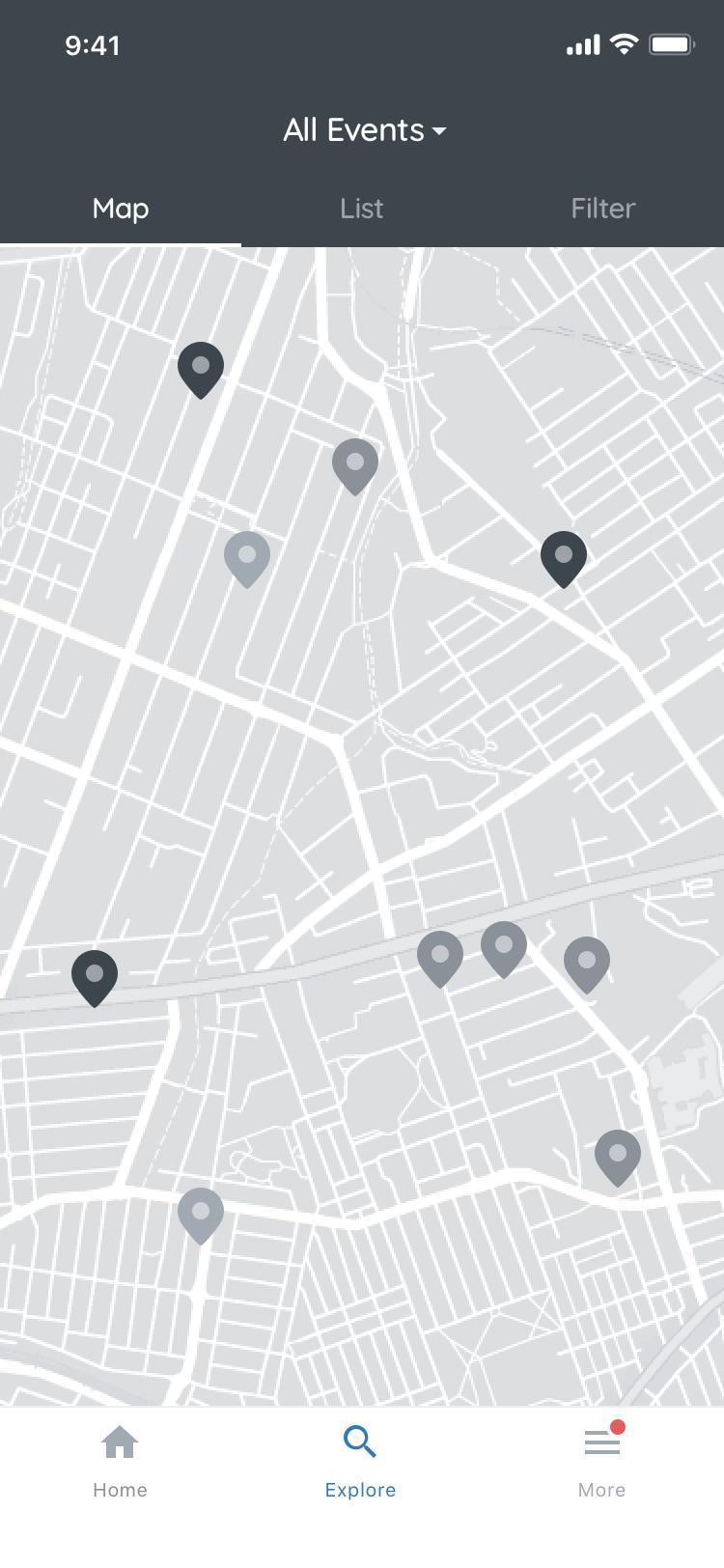
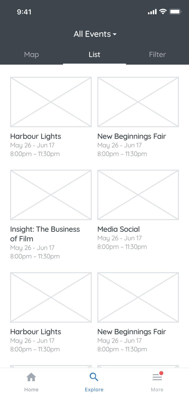
Final Basic Flow Wireframes & Information Architecture


Side note
Throughout the process, i’ve bounced ideas of the entire team, validating and invalidating ideas. One of which you’ll see, is the filter button being pulled from inline with the map and list view tabs. A developer mentioned filters being different from the other 2 so it made sense to show it in a different way. After a couple of different ideas, I landed back to how the filter button was shown last year.
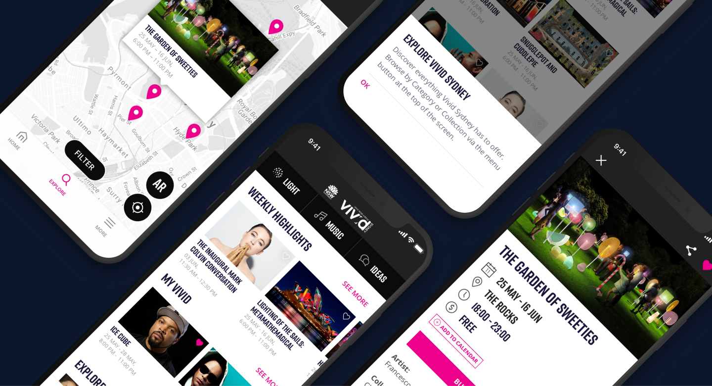
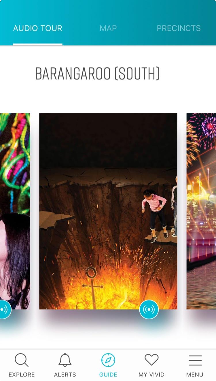
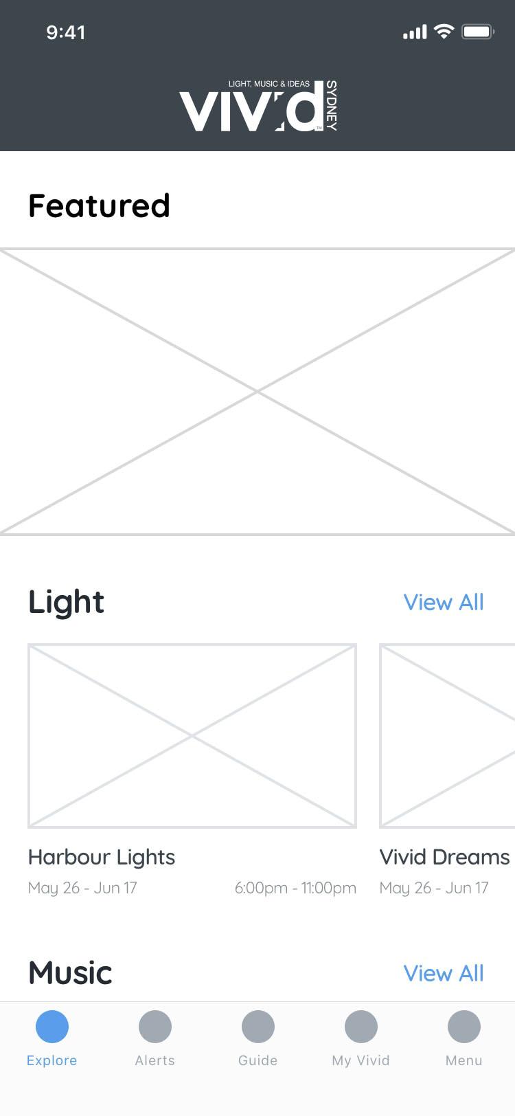
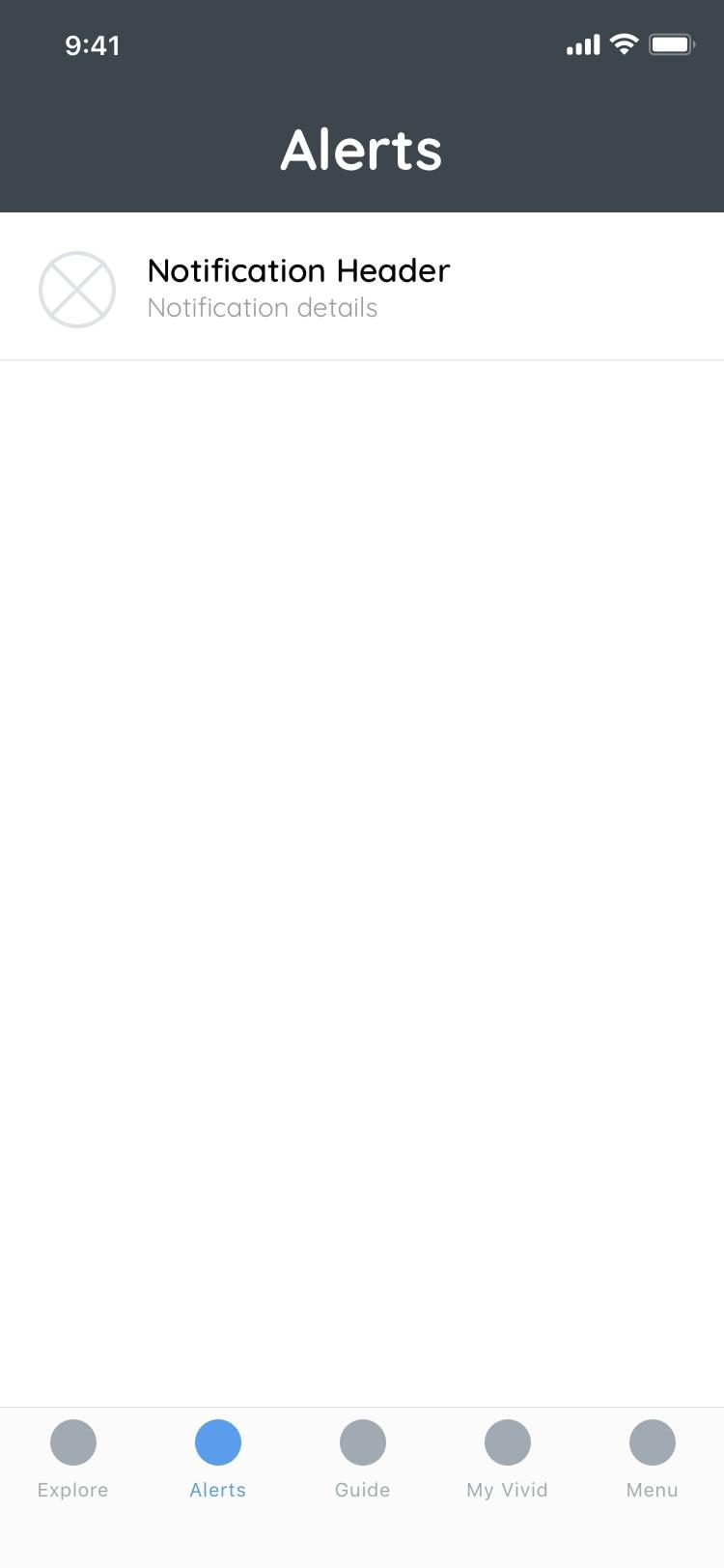
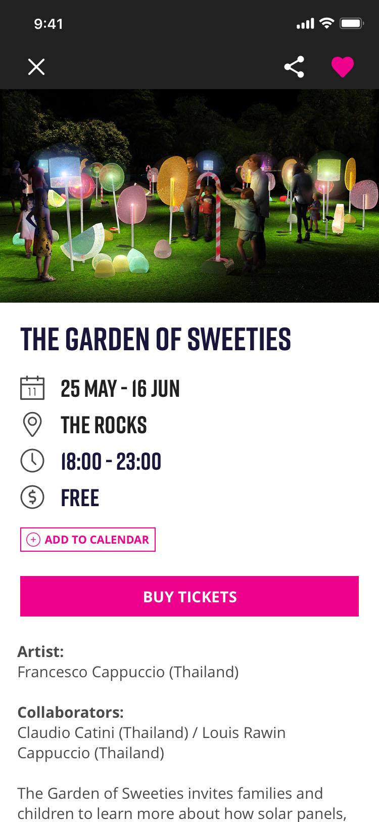
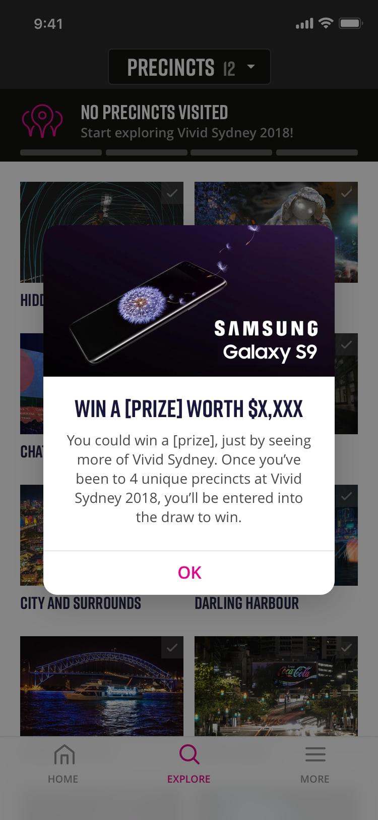
Mockups

Bonus 🎁
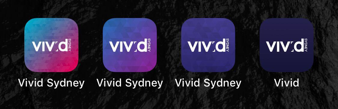
Icon Design
With the refined design, I tried a few different options, while retaining the low poly geometric branding.
- Previous Icon
- Option 1
- Option 2 - Chosen by Destination NSW
- Option 3
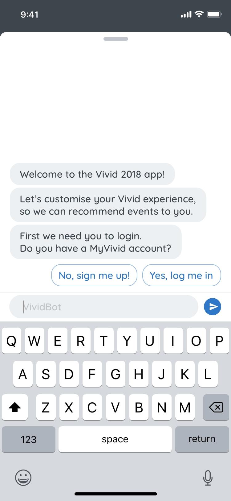
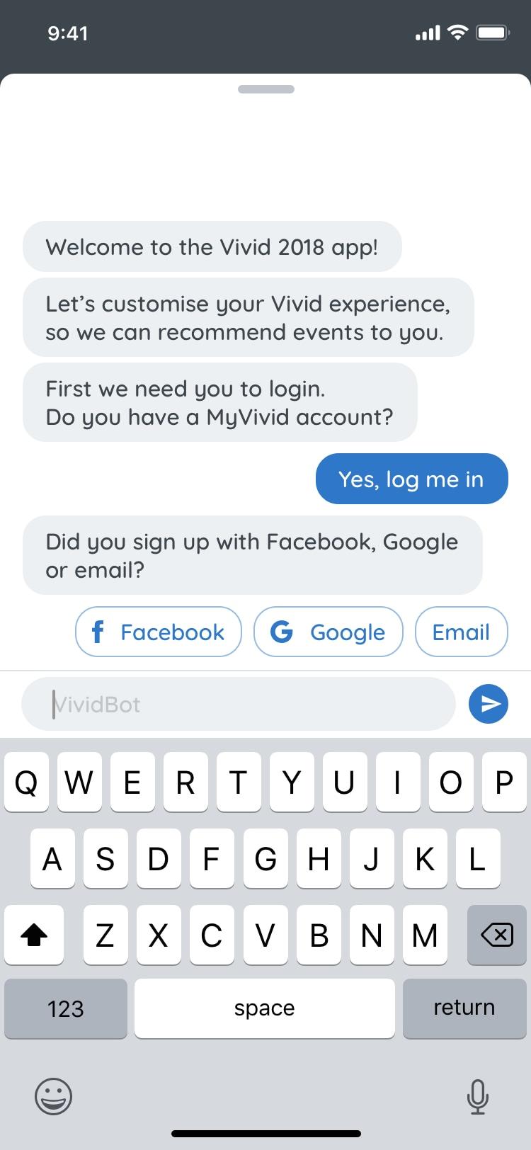
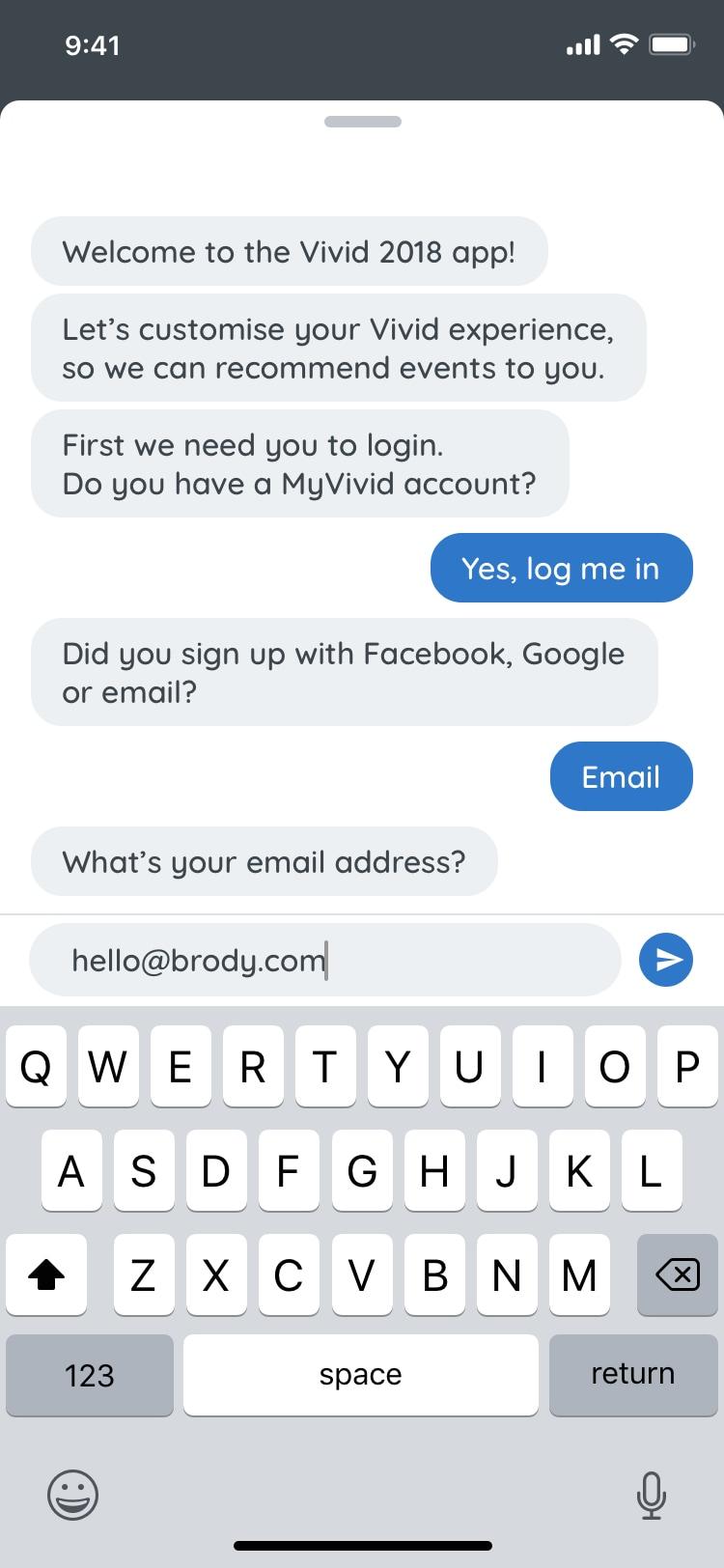
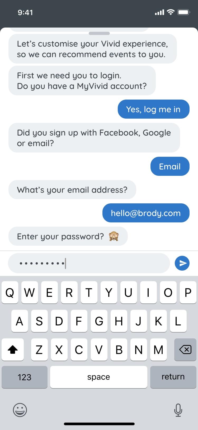
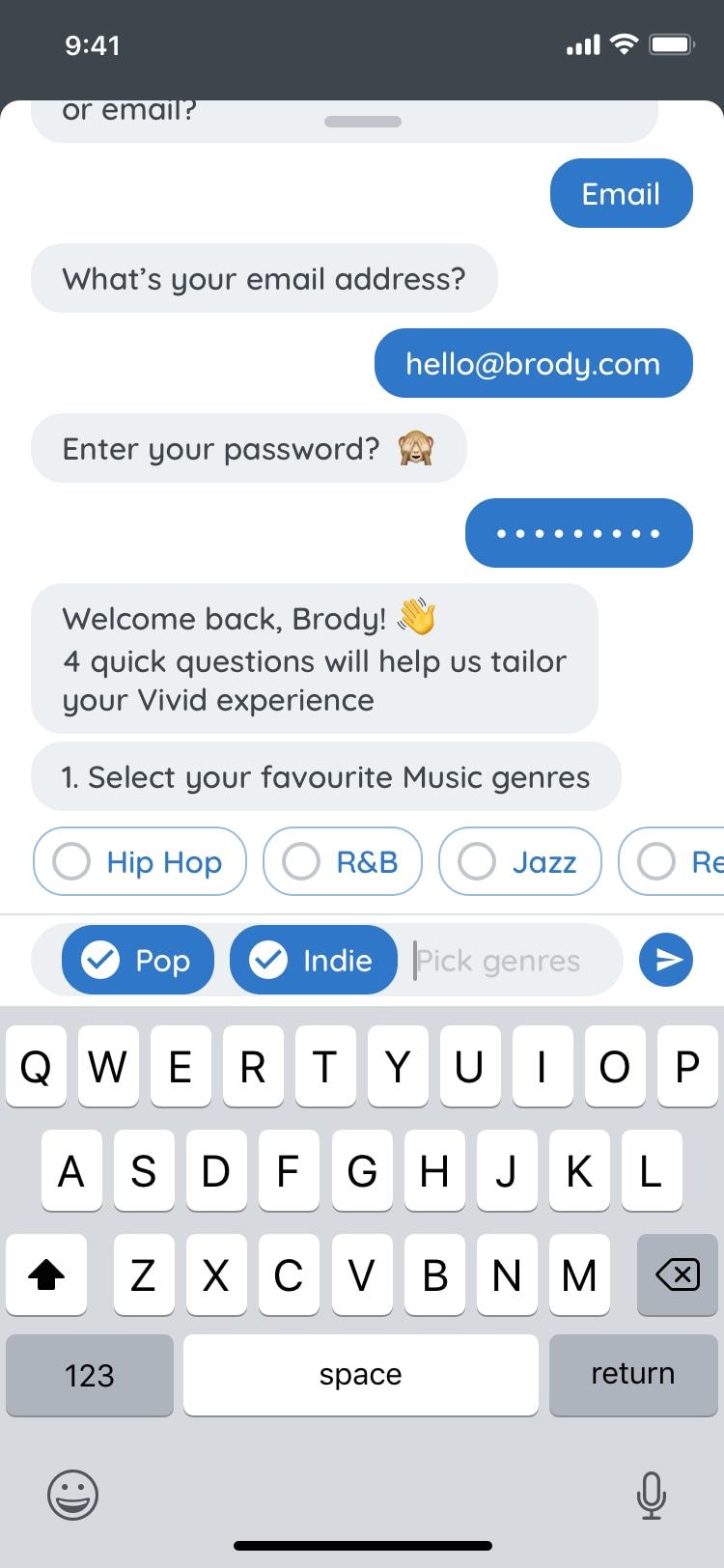
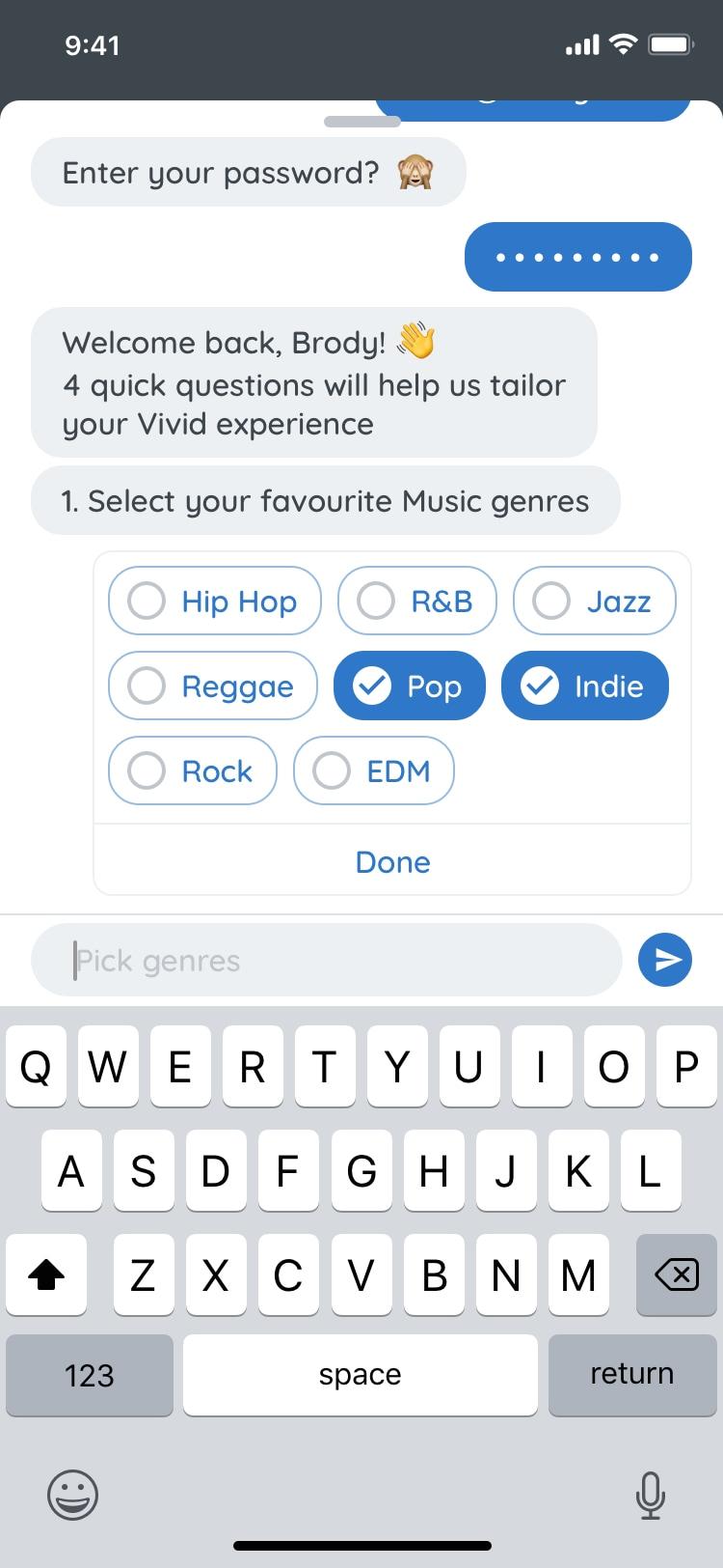
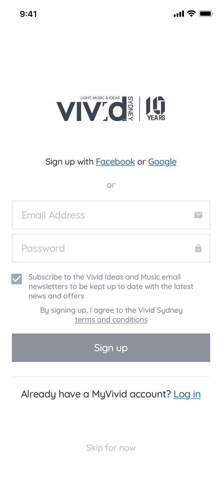
Chatbot Onboarding
During the wireframing stage, I explored the option of a chatbot to walk you through sign up/in & personalisation steps. Due to time constraints we opted for a simpler flow.