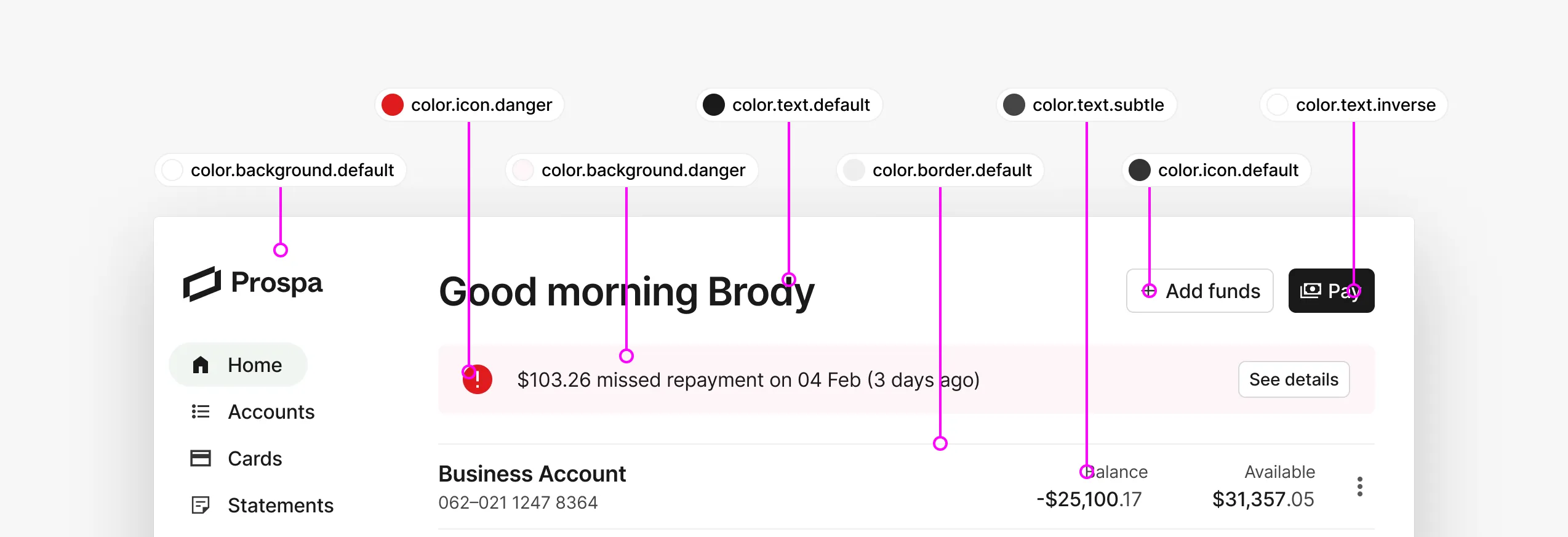
Developing a scalable design token taxonomy for Prospa's Design System
29 Nov 2023
This post covers how we developed our tokens at Prospa to create a flexible taxonomy for a small but powerful set of semantic tokens.
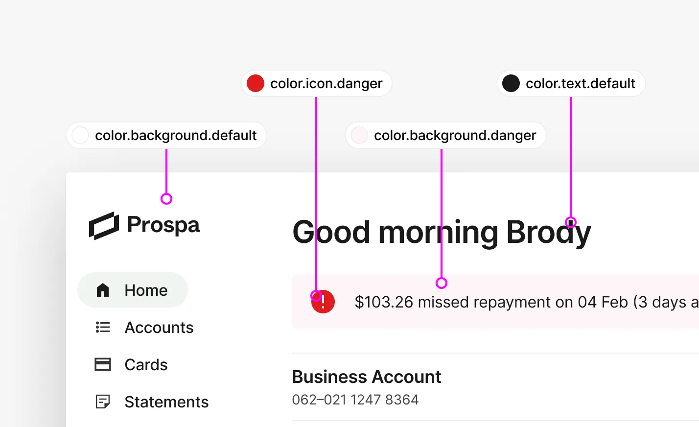
Prospa’s mission is to make business happen by providing small business owners with the cash flow solutions they need to grow and prosper. We are Australia’s #1 online lender to small business and committed to helping small business owners access the funds they need to grow.
After rolling out a rebrand through the legacy design systems, we decided to build a new design system from the ground up. This was a great opportunity to rethink our approach to tokens and how we could make them more flexible and semantic.
The problem
The existing set of design styles in the legacy design system was comprised mainly of primitives and a vague set of styles.
Only a small handful of colors were represented as semantic styles & even those were being used haphazardly throughout Prospa’s apps. For Prospa’s design system and our consumers, this system was problematic.

After conducting multiple rounds of interviews with our design systems consuming teams, which included both designers and developers, we identified several significant pain points:
- Token names were difficult to understand
- Token names were lengthy, and were truncated in Figma
- There were too many tokens to choose from
- Teams had difficulty identifying rationale behind token use
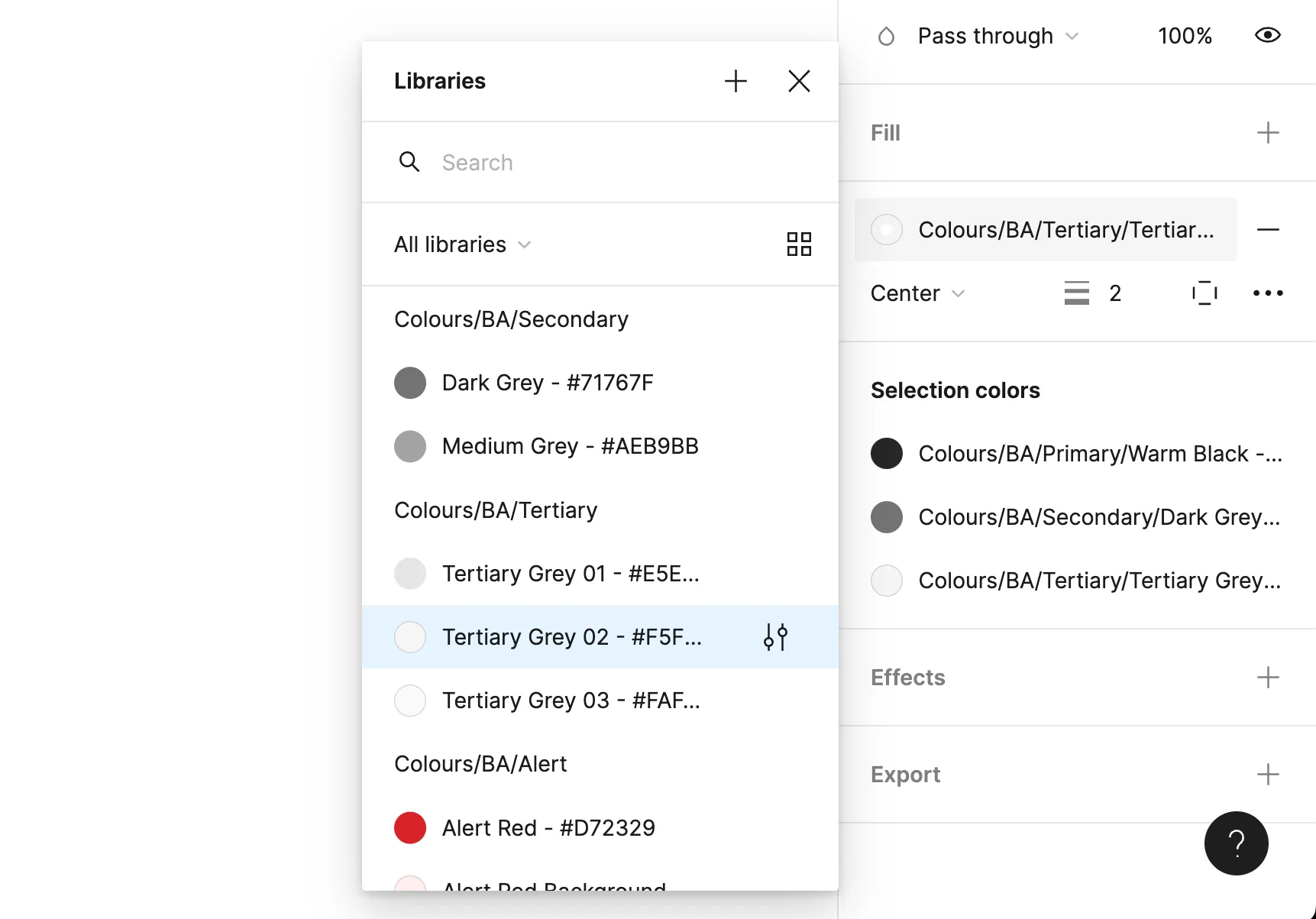
Component token names are truncated in Figma’s UI, obscuring important information from our users.
These issues left our design systems consuming teams lacking any of the logic or rationale behind design decisions. There was no way for them to understand semantically which tokens were applied to specific use cases. This stalled their capabilities in extending the system logic to their own custom components and experiences. The usability issues left our designers at a loss; resulting in their use of primitives directly.
Our designers asked what to use when, which naturally led to semantic tokens so that they could apply styles with an understanding of the rationale, and to clearly communicate between designers and developers regarding how to construct their components.
Finding the solution
Token names are how design tokens are referenced and identified by our users. Building a clear taxonomy assisted us in appropriately and consistently classifying tokens, as well as providing a scalable and predictable naming convention for our designers & developers.
We started defining semantic tokens and the taxonomy system based on some criteria:
- Favour clarity over brevity
- Consistency where possible
- Keep the set small
- Balance abstractions (keep generic but provide actionable context)
- Use an object-oriented taxonomy
With this approach, we would be able to identify tokens with broad use case coverage, and the taxonomy would be intuitive and rational. The number of tokens would be minimal to avoid extraneous use cases, but robust enough to have greater overall coverage. Finally, the tokens we created with this approach were tested with designers and developers from each of our consuming design systems teams to ensure we properly solved the problems we had.
What is use case coverage?
Use case coverage means the amount of use cases that would logically fit under a broader umbrella use case. For example, text-color-default could apply to many different use cases across any component of the application, whereas title-color-default would only apply to use cases of ‘title’ text.
This is how we framed the problem for our partner teams. Our solution needed to focus on use case coverage. In order to define this in a token system, we expressed how coverage changes for the different token types: primitives, semantics, and component tokens. By demonstrating the inverse relationship between precise contextual names and their use case coverage, we can see the value in a robust semantic token set.
Primitive tokens
Primitive tokens have no inherent design intent for how or where they should be used. Because of this, primitive tokens have the largest use case coverage for interfaces, since they can be used nearly anywhere. However, because of their lack of contextual precision, they hold little value in creating a cohesive visual language.
Primitives map a value to a generic name, which can be used almost anywhere but has no context.
Semantic tokens
Semantic tokens have a wider range of contextual precision (how or where they should be used). Because of this, semantic tokens also have a wide range of use case coverage.
Semantics provide context, which inversely relate to its use case coverage (generic has more; specific has less).
Component tokens
Component tokens highly contextual names mean they have very specific usage. Because of this precision, they can’t be reused very often and have less use case coverage than other token types.
Component tokens are highly contextual, so they can only be used in a small number of use cases.
This framing of token types and how they relate to use case coverage helped to frame the problem and solidify the solution for a more comprehensive set of semantic tokens.
Creating the taxonomy system
A core working group workshopped the initial set of tokens and draft taxonomy. Starting with color, we identified existing use cases and new required or potentially valuable use cases, such as basic text color options.
We performed several exercises during our workshops to create each category. First we grouped options based on their similarities — sometimes similarities in prior names, but more importantly similarities regarding how an option changes the design. We would then do word association exercises and scour a thesaurus for terms that best expressed what the options controlled. We dot-voted and discussed our options, which we later shared with partners and consumers to verify or revise our choices.
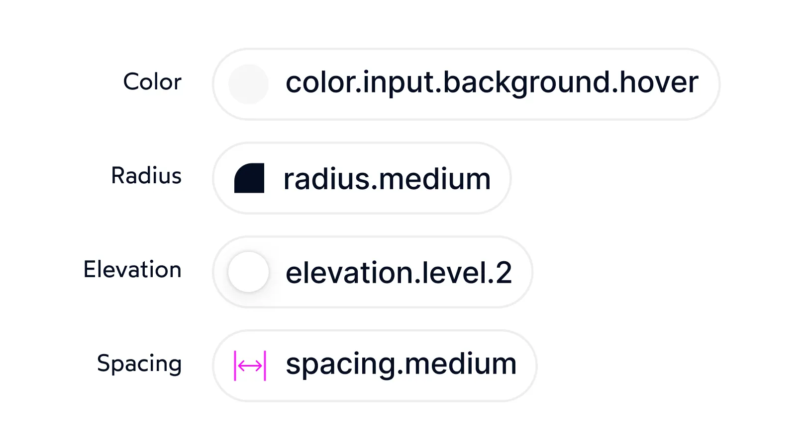
Semantic taxonomy used to classify color, radius, elevation, and spacingz token types.
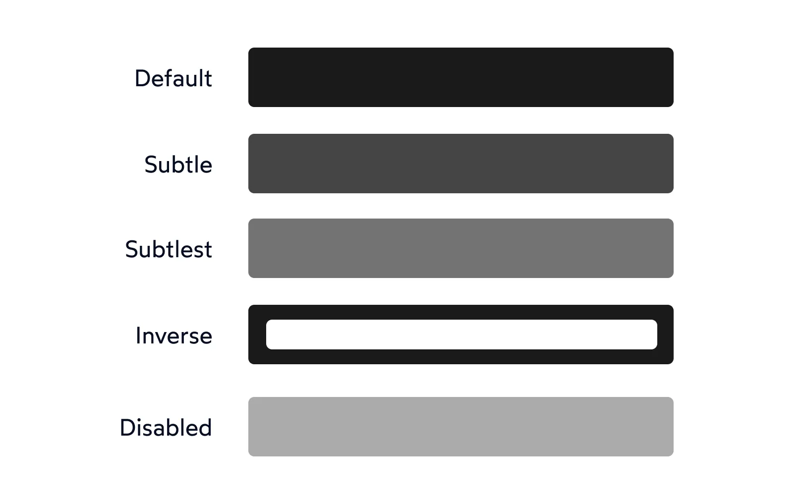
Color tokens as Figma color styles with nested taxonomy for filtering and usability improvements.

Color tokens as Figma color styles with nested taxonomy for filtering and usability improvements.
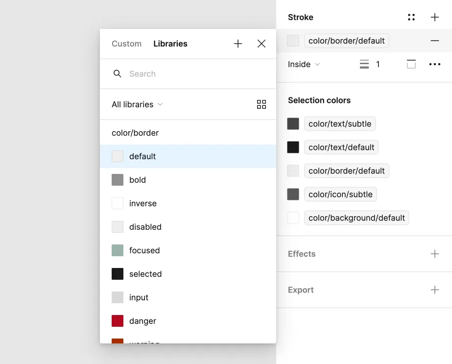
Color tokens as Figma color styles with nested taxonomy for filtering and usability improvements.
