Lessons from Don't Make Me Think
23 Nov 2023
Here are the lessons I believe were most meaningful:
01. Don’t make the user think!
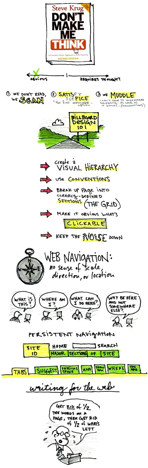
Surprise! Surprise! The most important principle according to Krug is: don’t make the user think.
Your design should be self-explanatory, the user should not waste time figuring out what your product is about and how to use it.
If you frustrate your users they will just go somewhere else.
According to Krug if something is usable it means that:
A person of average (or even below average) ability and experience can figure out how to use the thing to accomplish something without it being more trouble than it’s worth.
02. How people actually use the web
When we build our websites we usually imagine people carefully going through each page, reading what we wrote and considering what should be their next move.
In reality as users:
- We don’t read pages - we scan them looking for words or phrases that catch our eye.
- We don’t make optimal choices We tend to assume that users scan the page, consider all of the available options, and choose the best one. In reality, though, most of the time we choose the first reasonable option we come across.
- We Don’t figure out how things actually work - oftentimes we get a wrong idea on how a product works, and as long as it keeps working for us we keep muddling through.
03. So, how should we design accordingly?
- Don’t reinvent the wheel - One of the best ways to make almost anything easier to grasp is to follow the existing conventions - the widely used or standardized design patterns. This may include where things are usually located in the page, how things work and how things look.
- Create effective visual hierarchies - The more important something is, the more noticeable it should be. Things that are related logically should look related visually.
- Break pages up into clearly defined areas - Like: “this is where the navigation is”, “this is where today’s top stories are”.
- Make sure clickable things look clickable
- Eliminate distractions - If everything is trying to grab attention, nothing will. It will just be unpleasant and overwhelming. think of it as visual noise.
- Format content to support scanning - Use plenty of well written headings with a distinguished difference between levels of headings, keep paragraphs short, use bulleted lists, and highlight key terms.
04. Delete needless words
The internet is filled with words no one is going to read.
Extra words make clatter, and discourage the user, so In addition to formatting your content, you should also get rid of at least half of the words.
05. Navigation is crucial
People won’t use your website if they can’t find their way around it.
Unlike real life, in a website if we won’t design our site well the user won’t have any sense of direction, scale (how big is this site) or location (where am I on this site) It’s better if you use the current conventions in your navigation (for example the logo is usually in the top left, beneath that there is a navigation bar with the main sections etc.)
If your website is designed well these things should be found in first glance (even on a random page):
- The site logo
- The name of the page we are currently on
- Sections (the main sections of the website)
- Local navigation (more sections that are inside the section you are currently in) “You are here” indicator(s) (For example if i’m in the About page, the About button should stand out)
- A Search bar
06. First impression happens in milliseconds
Your home-page first priority is to convey the big picture: what the site is.
It should quickly answer these 4 questions:
- What is this?
- What do they have here?
- What can I do here?
- Why should I be here and not somewhere else?
If the user’s first assumptions are wrong, they begin to try to force-fit that explanation onto everything they encounter, creating more misinterpretations along the way and getting frustrated.
07. Arguments about usability
Teams tend to repeatedly fall into long discussions about usability questions.
There are several reasons why this happens:
- We unconditionally believe most users like the same things we do.
- Each team member has a strong professional passion for their field.
- There is no ‘one average user’ so trying to argue if most users are like this or that is even more pointless.
08. User testing is the answer
User testing is the best way to save time and avoid most usability arguments, it can be cheap and easy to do.
In Krug’s words:
It’s also the only way to find out if your website really works, it reminds you that not everyone thinks the way you do, knows what you know, and uses the Web the way you do.
Choosing participants
While it is good to choose a participant that matches your target audience, a user test with almost any person will help you discover the most crucial issues.
User testing doesn’t have to be a big deal.
testing one user early in the project is better than testing 50 near the end.
A basic test
- Bring 3 participants once a month
- Sit with each participant in a quiet space in front of a computer with a microphone.
- Screen share to the rest of your team in another room, make sure they can hear the test.
- Save a recording.
During the test
- Explain how the test works, make it clear that you’re not testing the participant, you’re testing the site, and ask them to share their honest opinions.
- Ask the participant a few questions about themselves (gives you an idea of how tech-savvy they are)
- Ask questions about the home page to figure out what the participant thinks this website is.
- Give tasks for the participant to do, don’t do or say anything to influence them, like asking leading questions, unless they’re hopelessly stuck.
- You can ask the participant questions after the tasks about anything that happened during the test
After each test session, the team needs to write down the three most serious usability problems they noticed during that session
How to create tasks
Word each task carefully, The tasks you test in each month will depend partly on what you have available to test. If all you have is a rough sketch, the task may consist of simply asking the user to look at it and tell you what they think it is.
Deciding what to fix
As soon as possible after each round of tests, the team should share their observations and decide which problems to fix and what they are going to do to fix them.
- Your first priority should be to fix the most serious problems first.
- You can ignore problems that every user seems to overcome quickly.
Create a collective list of the top 10 usability problems ordered from the worst problem to the least worst, then assign tasks until the next month.
You can also keep a list of issues that aren’t serious but are very easy to fix.
It’s never too early to start testing
You can start testing even before you begin designing your site, for example you can test competitive sites.
Other ways to test
You can also do remote testing (with anyone in the world) through software like zoom for example. Or even use services like UserTesting.com.
09. Desktop vs. Mobile
The basic useability principles of desktops are still the same in mobile, but there are some significant differences:
- Mobile screens are small - It may be a good idea to take a ‘Mobile First’ approach (Instead of designing the desktop first, then trying to squeeze everything to the mobile version, do the opposite).
- There is no hover on mobile - Many useful interface features rely on hover, as a designer it’s important to find ways to replace them.
10. Affordance & Flat design
Affordances are visual clues in an object’s design that suggest how we can use it. For example, the three-dimensional style of some buttons makes it clear they’re meant to be clicked.
Flat design is a popular minimalist style that makes things look more flat, it helps the screen look less cluttered, however usually the affordances get lost along the way.
If you use flat design make sure to use other visual cues to compensate for what you lose.
In conclusion
If any of you want a deeper understanding about those things (and other things I had to leave out), I suggest you read the book. It did feel a bit old sometimes but it has meaningful lessons that will always stay relevant and jokes that got me laughing a few times.
I hope I got rid of enough words, made sure this article was scannable ,left a good first impression and most importantly, didn’t make you think.